(AD – this blog post contains PR products*)
Our hallway was never finished after our initial renovation three years ago as we ran out of funds. It’s been a case of waiting patiently not only to make the space look nicer but to add the much, much needed underfloor heating as our hallway is FREEZING due to draughty floorboards and the external wall on to our side access. We can now finally warmly (literally!) welcome people into our home and coming home ourselves to a warm space is a game changer. Let me chat you through what changes we have made.
Flooring
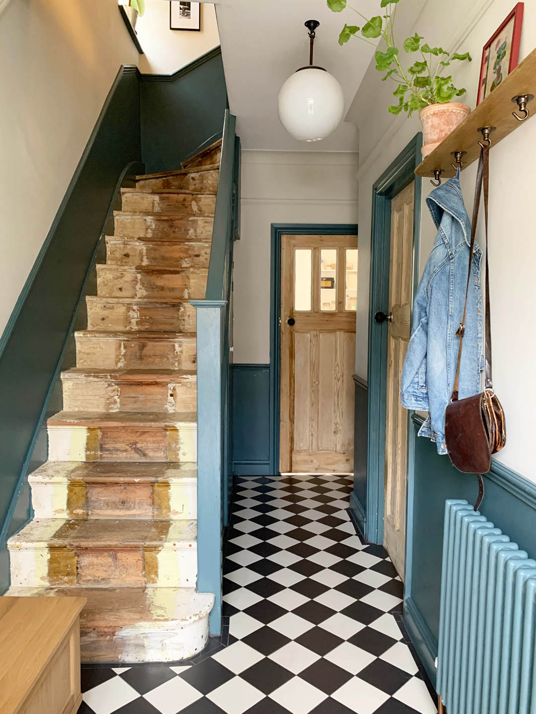
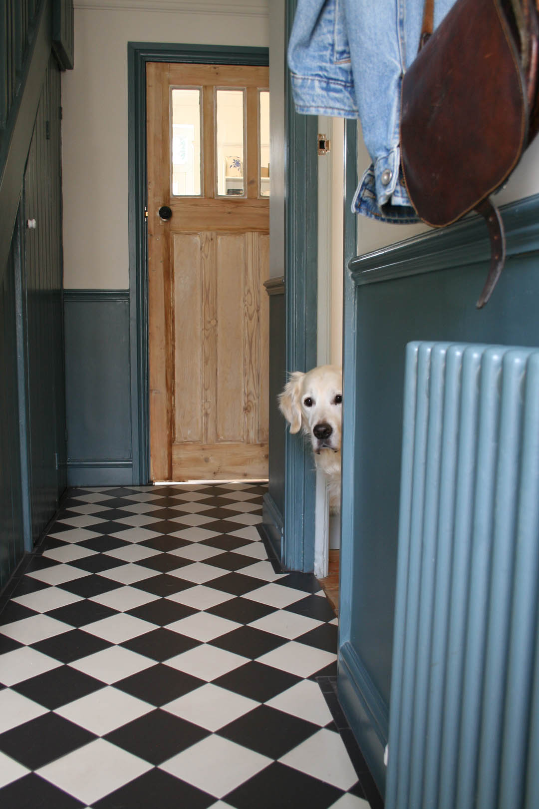
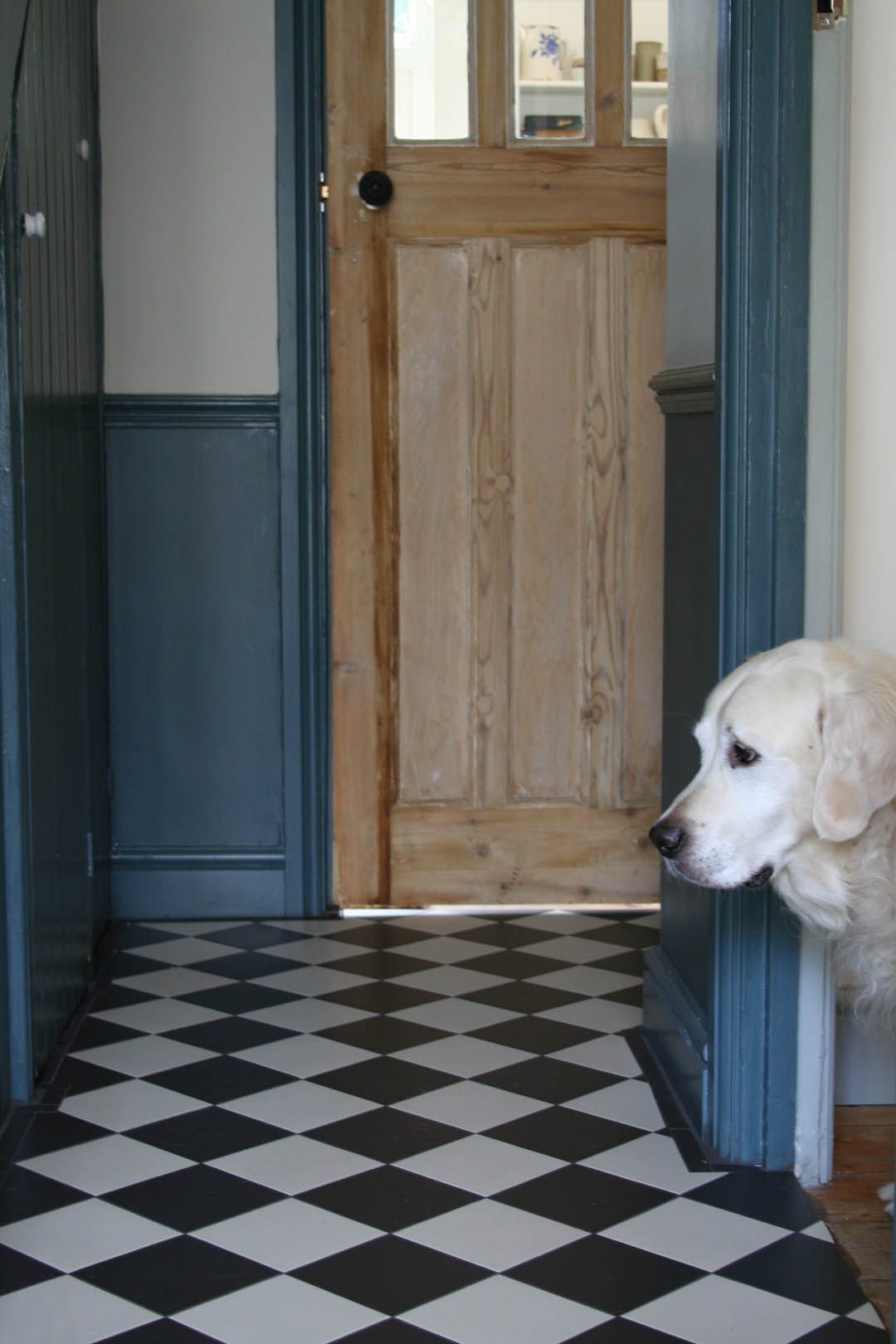
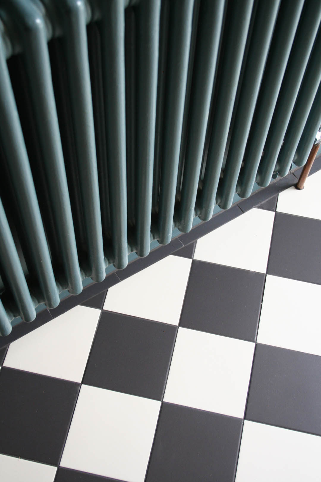
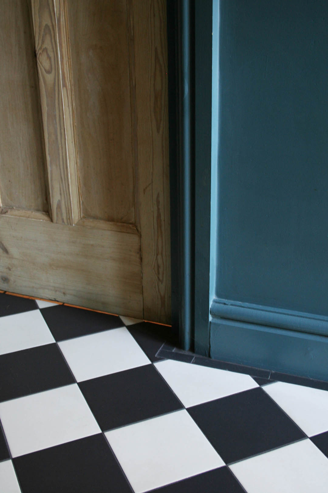
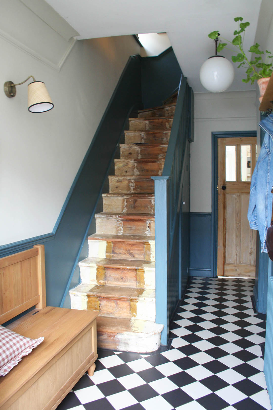
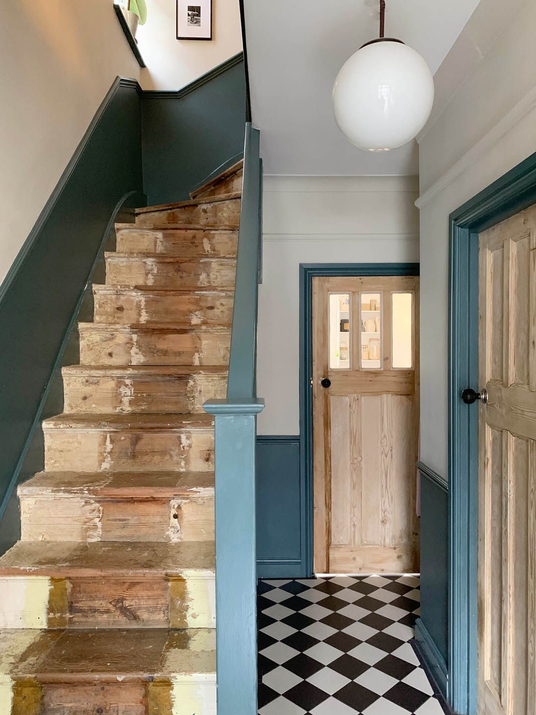
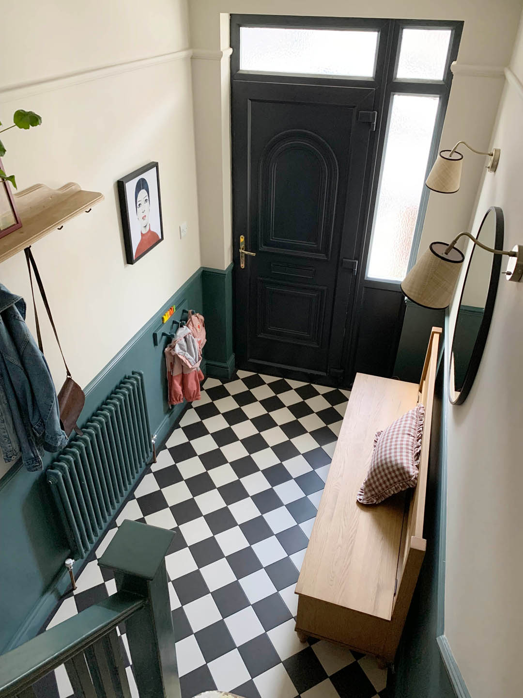
First and foremost on the priority list was to install underfloor heating. This meant we would have to cover up the original boards, which was just something I had to accept as I would have loved to keep the boards and have a lovely kilim rug BUT practically speaking this was just not an option. Underfloor heating and tiles were the answer to make the hallway significantly warmer and easily cleanable (having Otto in mind, as ever). I’m very happy with our tile choice – Black and White Victorian Quarry tiles from Walls and Floors* (PR product). Considering thirties properties were not traditionally tiled I didn’t want to choose anything too intricate or Victorian and I really didn’t want anything too contemporary as it’s just not my thing. I feel the black and white quarry tiles are classic and importantly they certainly won’t date. They will also enable me to change the decor in the future (I envisage a plaster coloured hallway in a few years!). They are so easy to clean and the black grout means they won’t end up looking mucky like some encaustic tiles and lighter grout can do. Importantly for me, the Victorian White Quarry Tile is not brilliant white but rather an off white that almost directly matches the Shaded White paint on the walls. This makes a huge difference as the white tiles don’t feel as stark as bright white ones can so I’m very pleased about that. The other bonus of these tiles is that they stretch out the space and make it feel so much bigger as well as reflecting the light so it really has a different feel to the old wood that absorbed all the light. They’re perfect.
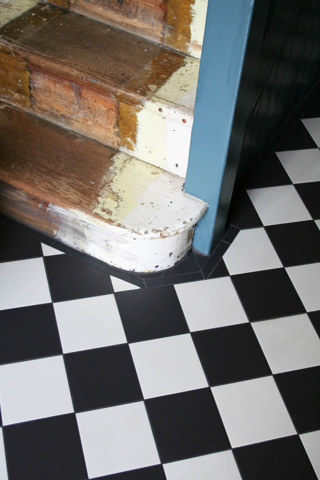
Our tiler was very impressed with the quality of the tiles and how easily they cut , which makes the fact that they were the least expensive tiles that I sampled even better! Our tiler did a brilliant job as I asked for the tiles to be laid in a diamond formation as I think that makes them look more traditional but it makes laying them much more difficult. I chose to buy a small border tile to go around the perimeter of the space to add a traditional touch but border tiles are very expensive so even though I wanted a thicker border comprised of two or three tiles there was no way we could afford that. The border tiles I bought were black individual rectangle tiles 150x25mm and they are exactly the same texture and colour as the black square tiles we have used in the main area. The black Mapai grout is brilliant as our walls aren’t straight and there were quite a few kinks to work around so where there were gaps the black grout fills in so well.
We did discuss with our builder the option of removing all the skirting (that we had put on new three years ago) and removing all the original boards but in the end we opted to keep the boards and use a more expensive UFH system called Schluter. This did mean that we have ended up with less skirting as the level of the floor is higher but it really isn’t noticeable. It also meant far less labour for the builder so the whole job ended up being £1700.
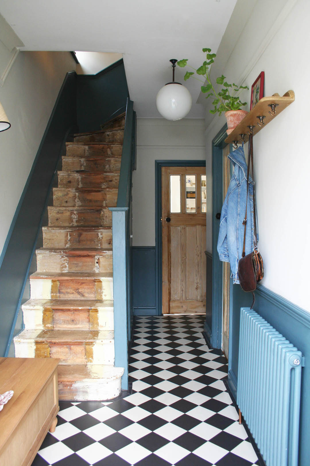
Three weeks in and the combo of UFH and tiles is dreamy. I still can’t quite believe I’m able to walk around in socks in comfort and Mimi lies on the floor every morning whilst I faff around trying to get us both out of the door. Otto is also a massive fan and has been really enjoying his new napping spot. We’re all very, very pleased!
Storage and seating
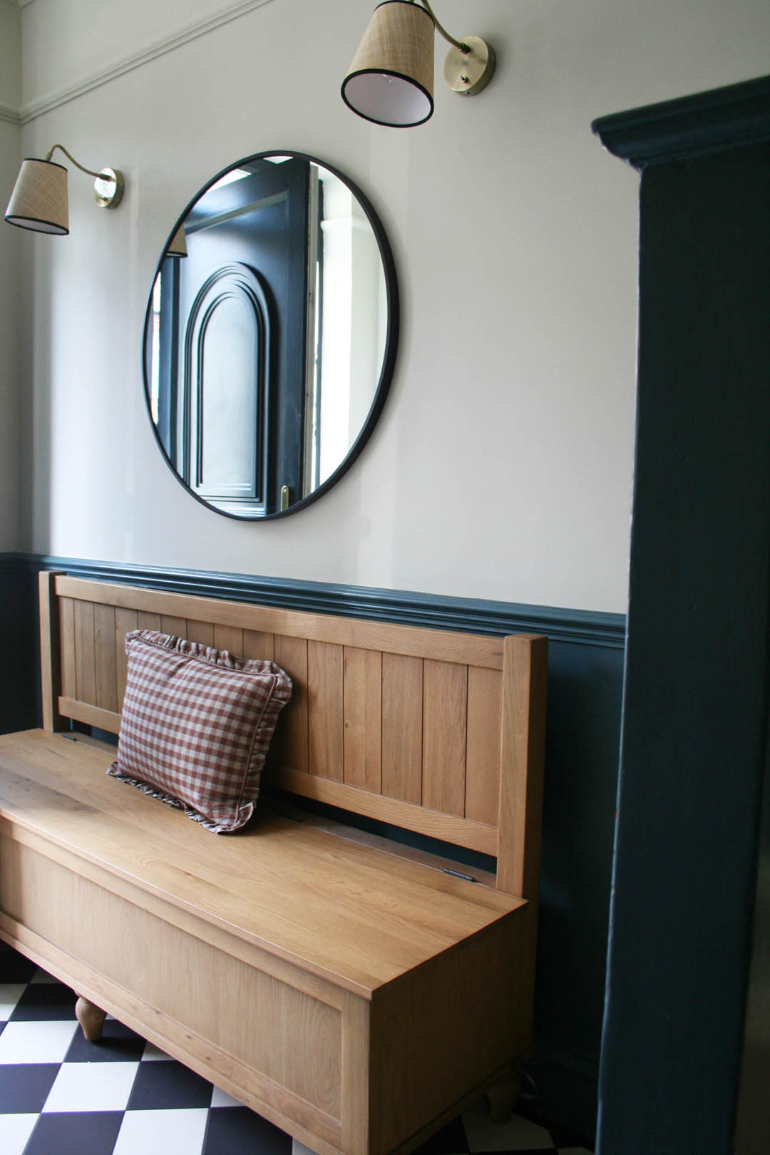
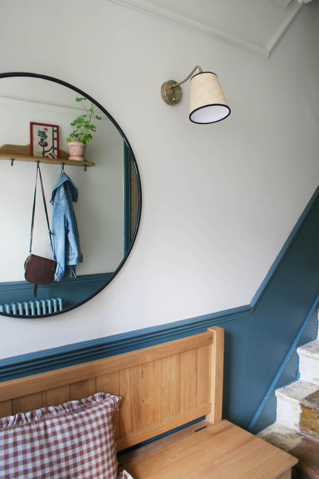
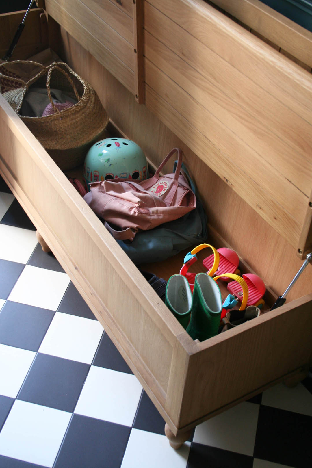
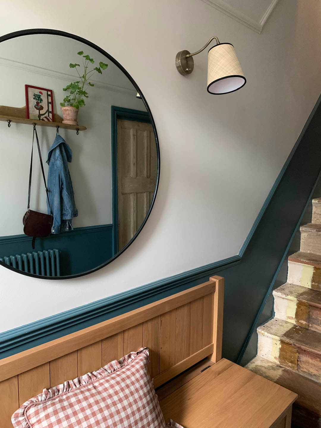
The next big change I wanted to make was to remove the ‘temporary’ console storage table I bought secondhand three years ago for £15. It always looked so untidy as the storage was open and we always ended up going into the sitting room to change our shoes as there was no where to sit. Therefore, I was very sure that I wanted a storage seat and I did have a good look at antique options, specifically Hungarian settles, but generally they are either too big or too small for our space. They also have very high arms, which can make a space feel more cramped, and often the storage seat isn’t fully acessible. I did find one but the seller let me down so I was thrilled to come across this Elkstone Oak Monks Bench from The Cotswold Company* (PR product). Not only is it the perfect length but it has no arms, which makes it feel far less imposing and we can perch on the end if necessary. Also, the entire seat lifts up so there is SO MUCH storage as well as a soft closing function. We can now store woollens, bike helmets, excess shoes, shopping totes and all those other bits and bobs that are unsightly but need a home in a hallway. We are going to try and find some dividers to make the storage more organised. We can just tuck every day shoes under the bottom of the bench too as it stands on legs. It’s completely ideal.
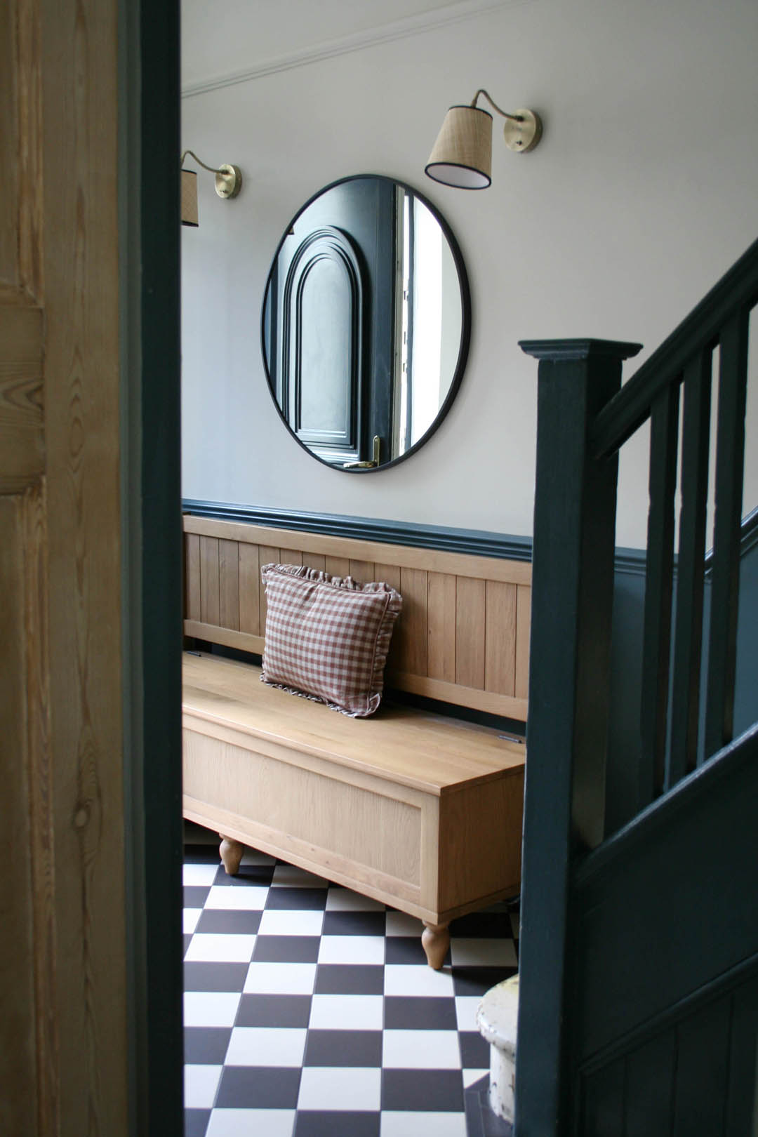
The Cotswold Company have a huge amount of hallway furniture and accessories and I have to say it was up there with one of the best furniture orders/deliveries I have experienced. Not only was the bench ‘in stock’ so no huge lead times but it arrived about two days after the order was placed and the delivery company was brilliant; great communication, changed the allocated day for me with no issues and they were super careful when they made the actual delivery. The packaging was great and there wasn’t a single quality issue, which if you order furniture regularly you’ll know is extremely rare. Anyhoo, having a seat in the hallway makes everyday life much easier and we’ve found when guests come they are much more likely to leave coats and bags on there rather than bringing them into the sitting room, which is something that drives me a bit mad (just me?!).
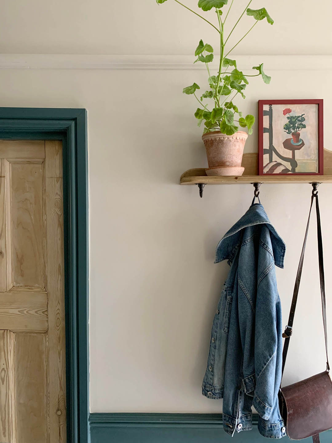
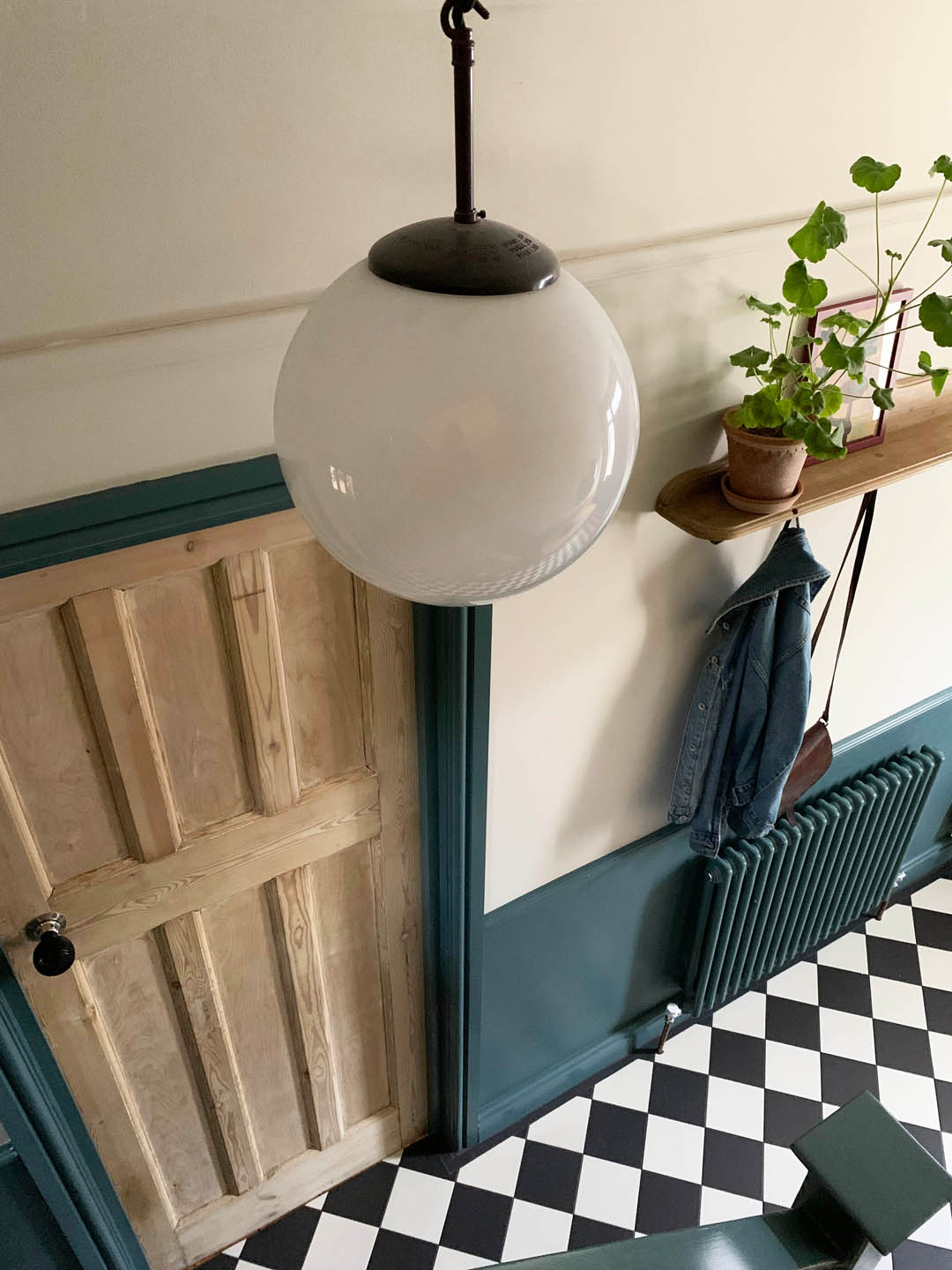
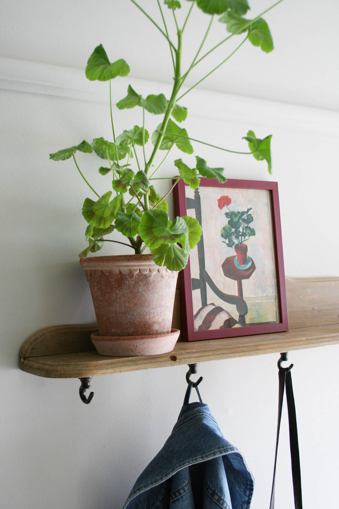
The other storage we added was a little street find shelf that we had mounted as a shelf below a mirror but I realised that if we turned it upside down we could add some hooks and use it as a peg rail and the shelf above is very handy for glasses etc.
Wall colour
The woodwork has stayed exactly the same and was painted Inchyra Blue three years ago. I still really love it. However, one big budget saver we made was agreeing to have all walls in the house painted brilliant white. I knew I would change them slowly as we got to know the house and I’ve actually really enjoyed the process of taking my time. I painted the walls myself before the tiles were laid and chose Shaded White to complement the Inchyra Blue (both Farrow & Ball)and bare wood of the doors. It brings so much more warmth to the space. I haven’t painted the ceiling yet (the brilliant white really sticks out like a sore thumb to me) but maybe after Christmas! I decided to paint up to the cornice as that makes the ceiling feel higher and as it’s not a nice cornice it doesn’t emphasise it more than needs be.
Lighting
A huge priority for me was to improve the lighting in the hallway during this process. I’ve been desperate for wall lights to add some really warm light so I asked the builder to add a plug socket behind the bench which cost £100. I didn’t want to pay more to have the lights chased in and a socket gives flexibility if we ever shift things around or want a floor lamp, for example. I found relatively inexpensive wall lights on sale although I share the link with the warning that they come with plastic cabling (that I’ve removed in order to change it), bright white lampshades and euro plug adapters (so I will have to add UK plugs when I re-wire them). However, even with new lampshades, new cable and plugs they have still worked out about half the price of what I would have paid for an equivalent wall light. I bought new lampshades from the very talented Munro & Kerr that work so well in combination with the tiles and colours as well as adding some lovely texture and I ordered some linen coloured fabric cable that was delivered today so I will add that to the lights later. I am thrilled with the warm cosy light – thrilled!
Accessories
The huge 80cm round mirror above the bench is perfect and bounces much needed light around. A plant up on the shelf makes more difference than you could ever imagine and I would really like to find a lovely piece of art to go where the portrait currently is next to the front door but all in good time.
Still to do
You may have noticed that the stairs are still in their raw state but we don’t quite have the strength to deal with those and I know I want to install Unnatural Flooring manmade sisal when we can afford it so there’s not much motivation to go to all the effort to paint them. We shall see. The front door is still very much on the list of something to change but in the mean time I plan to re-paint it a lighter colour as it feels very dark with the new tiles.
But other than that it really does feel like a finished space now, which is amazing after three years of it feeling like the remnants of the renovation building site. If you have any specific questions about the tiles or anything else do let me know and I hope you like the changes!
Katy x
Absolutely beautiful 💚
WOW gorgeous … and that bench is divine. it all looks SO lovely and welcoming. UFH must be so luxurious feeling!
I love so many british made products, too bad I cant get them here! Congrats!
Maybe an ikea runner or two until you can get the sisal you want – for the stairs.
That Otto sure is sweet!
Absolutely gorgeous! We’re also considering these tiles, but just wondering on costs would you have ever gone for this tile without a border? We are lifting up skirting boards anyway because they need replacing so I’m wondering if I can get away with not having the border.