Decoupage

A really easy way to transform any object is to use the traditional method of decoupage. It’s one of those crafts that is very relaxing and all-consuming: you can spend hours cutting out pictures from magazines. It’s also really easy and almost impossible to make a mistake – always good in my book.

I recently bought Homemaker magazine (I’m obsessed with magazines) and it had the most delightful pull-out that included lots of prints and patterns – prime decoupage material. There were six pages of vintage-looking seed packet designs that I wanted to use for my seed packet holder (which is an old PYO strawberry punnet). Decoupage is so versatile and you can do all sorts of things: boxes, mirrors, chairs, lampshades, the list is endless.

All you need to do is start collecting images, words, backgrounds, patterns from magazines and newspapers – anything will work. Have a look at the make-up box and mirror at the bottom of the post for ideas on what type of thing to look out for.

Here’s how you do it…

You will need:

How to decoupage

PVA glue, water. paint brush.

Vintage flower seed packets

A collection of images and words from magazines and newspapers and/or wrapping paper.

Strawberry PYO punnet

Something to decoupage – I’m using a PYO strawberry punnet that I use to store seed packets.

Tutorial:

How to decoupage

1. Mix the glue and water together in equal measures. Use the brush to paint the glue onto the surface you want to decoupage and place the picture onto the glue. 2. Then paint over it with the glue mixture too. Squeeze out any air bubbles with your fingers.


How to decoupage

3. Every piece of paper you apply should overlap another so there are no gaps. When you get to a corner or edge bend the paper over it so you get a smooth finish. Once it is covered allow to dry for a couple of hours. 4. Then paint over it again with the glue mixture. Allow it to dry and then apply another coat of the glue mixture. You can then do a coat or two of varnish if you want a gloss finish. Varnish will also make your decoupage last longer.

How to decoupage

Finished!

Other examples of decoupage that you could try…

How to decoupage

My 21st birthday present from my friend Agnes.

How to decoupage

It’s a make up box – still love it 12 years later!

How to decoupage

Decoupaged mirror that Agnes made for our friend Amy.

How to decoupage

Drill holes and thread with rope to hang.

decoupage card

My birthday card that my little sister made me. So much nicer than a shop bought one.

Have a go!


Art Deco – love or hate?

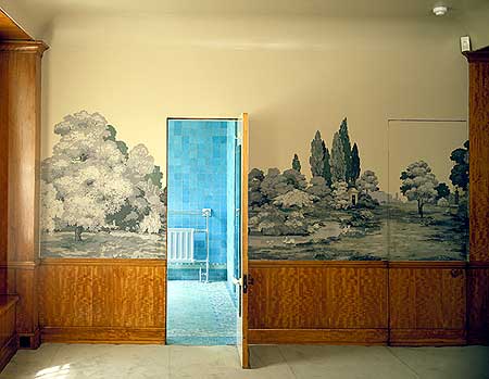
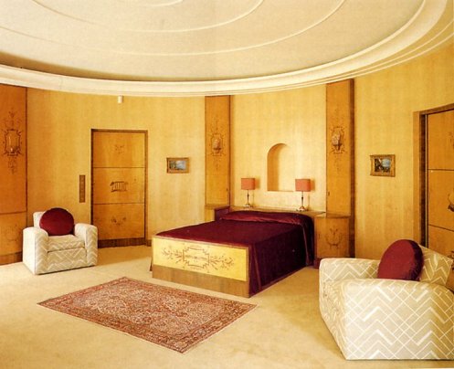
The media has been filled with the joys of Art Deco recently due to the release of the Great Gatsby. It just so happens that I went to an amazing Art Deco house and antiques fair a couple of weeks ago so I thought I’d share it with you. You never know, it may wake a love of all things Art Deco in you.

Eltham Palace, in South East London, was originally the child hood home of Henry VIII. The remains of this home can still be seen but the wealthy Courtauld family built a house next to the remains of Eltham Palace and it’s among the finest examples of Art Deco architecture in England. This juxtaposition of architectural styles make this a unique place to visit and very inspiring at that. And what better place to have an Art Deco fair? Basically, my ideal afternoon.

Art Deco style began in the 1920’s in France. It flourished in the 1930’s and 40’s and emerged from the interwar period when industrialisation was transforming culture (can you tell I’m a History teacher?!). The new machinery and materials of that era influenced the movement to develop; gone were the organic motifs of the its predecessor Art Nouveau, to be replaced by symmetry and geometric shapes. The style is often characterised by rich colours, luxury, glamour, lavish ornamentation and bold geometric shapes.

I love some Art Deco pieces but there are others that I hate. However, I love eclecticism so it’s all about picking and choosing what you like from a certain era and more often than not it will blend well with other pieces whether they be Victorian, mid-century or contemporary.

Have a look for yourselves and decide whether you love or hate…

Eltham Palace Art Deco architecture

This the 1930’s addition to the building, built by the Courthalds. To the right is the remains of the Great Hall, which formed part of the childhood home of Henry VIII. 

Eltham Palace Art Deco interior

LOVE. This was my favourite part of the building. I love the space, light, simple shapes and muted colours against the white.

Eltham Palace Art Deco interior

HATE. Wood panelling is a classic feature of Art Deco style. Would I want it in my own home? Probably not.

Eltham Palace Art Deco interior

HATE. To me, at first glance, this all looks disgusting. But you can always find inspiration if you’re willing to look for it. The symmetry and structure of this room appeals and this is something that can be copied easily.

Eltham Palace Art Deco bathroom

HATE. Totally disgusting. But what about the shape of the bath? There’s always inspiration lurking.

After we’d been into the house we went to the antiques fair that was being held in the Great Hall. The Palace hosts these fairs twice a year (next one is in Septemeber). Have a look at some of the things I spotted…

Eltham palace Art Deco antiques fair

The Medieval Great Hall.

Eltham palace Art Deco antiques fair

LOVE. This would work perfectly on a mid-century coffee table or sideboard.

Eltham palace Art Deco antiques fair

HATE. I’m really not keen on the Art Deco figurines, especially the face plaques.

LOVE. This chair (a snip at £4500) would fit in with any interior.

Eltham palace Art Deco arm chair antiques fair

LOVE. I very nearly bought this. The footstool folds under the chair and becomes a conventional arm chair.

Eltham palace Art Deco antiques fair geometric mirror

LOVE. This geometric mirror is typical of the Art Deco style. This particular mirror is simpler than than the average and could slip into many different interiors.

Eltham palace Art Deco antiques fair sewing box

LOVE. I want this sewing box bad!

Art Deco Burleigh tea cup

LOVE. Art Deco Burleigh tea cup – my only purchase of the afternoon. I totally adore Art Deco crockery.

What about you? Love or hate?


Liberty print apron

This is a really quick and easy sewing project that costs very little and makes a lovely present for a little person or make it for yourself. If you don’t want to make the apron itself, you can buy a really cheap, plain white apron and customise it with the pocket and trim, even easier and quicker. This is also a project that you could hand-sew if you don’t have a machine.

You will need:

1. 70cm x 60cm of cotton twill fabric for achild’s apron that I bought from eBay OR you can buy a ready-made apron that you can get from Amazon very cheaply.

2. 2m length of cotton tape for the apron ties, if you are making your own apron, that I bought from eBay.

3. 30cm x 30cm of your choice of fabric for the pocket. I used Liberty’s Lytton print from the Bloomsbury collection. I bought this from Fabrics Galore, which is a great haberdashery in Battersea but they also do online orders – very handy.

4. 25cm x 5cm strip of fabric for the trim.

5. Fabric scissors, chalk, ruler, pins.

Tutorial:

1. Fold your cotton twill into half and draw a template of half an apron. By folding it in half it will ensure the sides are perfectly symmetrical. If it’s for a child it should be around 70cm long and 60cm wide (adjust this according to how old the child is or if it’s for an adult).

Child's apron with Liberty print pocket and trim

2. Hem all round the edges of the apron.

Child's apron with Liberty print trim and pocket

3. Sew a 60cm length of tape onto each side of the apron (on the wrong side).

Child's apron with Liberty print trim and pocket

4. Sew a 60cm length of tape onto the back of the apron to make a neck loop. Notice I made the hem at this point of the apron a good inch.

Child's apron with Liberty print trim and pocket

5. Fold and press well a 1cm hem all round your pocket piece. Pin the side edge of the pocket.

Child's apron with Liberty print trim and pocket

6. Sew the hem along the top of the pocket.

Child's apron with Liberty print trim and pocket

7. Fold the apron and pocket piece in half. Match up the creases so your pocket is centralised.

Child's apron with Liberty print trim and pocket

8. Pin and sew the bottom side of the pocket onto the apron. Position the needle so you catch the hem.

Child's apron with Liberty print trim and pocket

9. Pin the sides of the pockets onto the apron so that the top of the pocket is 2cm further in than the bottom of the pocket. This will give the pocket volume.

Child's apron with Liberty print trim and pocket

10. Do the same to the other side of the pocket and it should look like this.

Child's apron with Liberty print trim and pocket

11. Fold and press a 0.5cm hem nell four sides of the trim strip.

Child's apron with Liberty print trim and pocket

12. Pin the trim strip onto the top of the apron. Top-stitch all round the trim piece.

Child's apron with Liberty print trim and pocket

Finished! I’ve instagrammed it for the Liberty Lifestyle and Instagram competition…fingers cross I win!

More design classics I want in my life!

A bit of design inspiration for the weekend: sometimes it’s a good idea to go to the really expensive, out-of-reach shops to get an idea of what you like, don’t like and ideas for your own home. This will help you figure out what is worth saving up for and what you could easily find elsewhere for cheaper.

Matt Carr Rolly  retro coffee table

I’ve hankered after this Rolly coffee table, deigned by Matt Carr, for a long time. It’s on sale on eBay at half the retail price (click on picture for link).

Original BTC table lamp

I’ve had to admit defeat with this Original BTC lamp: I can not justify spending nearly £400. Instead I’ve bought a copy from John Lewis for £45.

Liberty silk rug

Dreamy. That’s all.

Picquot ware kettle

This Picquotware kettle is next on my present list. Love the contrast between the stainless steel and beautiful sycamore handle.

Heals Mistral sofa

A timeless sofa from Heal’s.

Penguin Donkey

How sweet is this? It’s called a Penguin Donkey. I want it bad! CLick on the picture to take you through to Objects of Use, which is such a nice online shop.

B&W speakers

Those of you that know me well, know that I do not stop complaining about our HUGE TV and speakers. I HATE them. On a recent visit to a friend’s house I saw these B&W speakers that I think I could live with. I think.

Hans J. Wegner Wishbone chair

Believe me when I tell you that this Hans J. Wegner wishbone chair is seriously comfortable.

What are you currently hankering after?


The Wapping Project

The Wapping Project is one of my favourite places. We discovered it a couple of years ago on a walk down the River Thames. I love exploring Wapping and Rotherhithe as the streets are lined with converted warehouses and factories that are now beautifully restored apartments (so jealous!). When we came across this building it caught my attention immediately as it is so imposing. There’s a lovely garden with chairs growing on trees and a very sweet greenhouse that is a community bookshop and meeting house. As we walked inside I was rendered speechless. The space is enormous and the interior architecture is stunning: exposed brick, utilitarian tiles, vast hooks dangling from the ceiling, concrete floors, lead windows. It’s a space that I dream about owning and renovating into a home. The combination of soaring ceilings and abandoned machinery with iconic modernist furniture would inspire anyone. The space has now been converted into a restaurant and art gallery. In the evenings, the machinery is covered in candles and it is really rather magical.

So, before you have a look for yourselves, a quick history lesson – do you know that I’m a History teacher? Oh, yes. The Wapping Project was a hydraulic pump house. A network of water pipes used to run underneath the ground across London (marked in red on the map below). Wapping pump house would pump water through these pipes to power a vast range of things, including the lift at Selfridges. Good fact.

Now, have a look for yourself…

The Wapping Project industrial factory style architecture

The Wapping Project factory industrial architecture

The building has retained its ceiling height throughout with no additional internal walls so the space is immense.

The Wapping Project factory industrial architecture

The sleek, modern Vitra furniture contrasts with the old industrial building (I’ve got no idea who those weirdos with their thumbs up are…).

The Wapping Project factory industrial architecture

The pump house machinery still stands proud, albeit functionless.

The Wapping Project factory industrial architecture

The Wapping Project factory industrial architecture

The Wapping Project green house with deck chairs

In the gardens lies a little bookshop greenhouse.

The Wapping Project art installation

There are also art installations in the garden, which grab your attention as you walk by.

The Wapping Project art installation

The Wapping Project green house

Inside the bookshop greenhouse.

Crates used as shelves

The Wapping Project factory industrial architecture