Finishing off our kitchen

We moved into our house just over six months ago now and at the time we promised ourselves that we would finish off the kitchen within that first week after doing most of it as a rushed DIY job the week before we moved in. Fast forward six months and no prizes for guessing that nothing had been ticked off the to do list including tiling the splash back, which by this point was getting more and more unpleasant as it gets splattered by food cooking on the stove, coffee from the machine, water from the sink and the chopping boards leaning against it have scuffed it badly. Therefore, when Maitland & Poate got in touch about showcasing their antique tiles sourced from Spain in our kitchen it was just the push we needed to finally finish off the job.

I found it very difficult to choose which tile to use as the family team behind Maitland & Poate source such beautiful genuine antique cement tiles and each design is so different. My first choice was actually this design but Jules vetoed me on it as he didn’t like the colours so we compromised on the Ceniza tile. We chose this tile because the colours tone so well with the Light Blue on our wood work and the Railings that we painted our kitchen cupboards.

Jules and I decided to install the tiles ourselves to save money although it is advised to get a professional to install cement tiles as they are porous and need sealing. These particular tiles are also much thicker than average glazed tiles. However, we tiled our last kitchen so we already had a tile cutter and all the tools and because these tiles have already been sealed during their lifetime they are far more forgiving than brand new cement tiles that need to be treated with far more care so that they don’t absorb moisture and stains before being fully sealed.

Maitland & Poate also sell a range of new cement tiles and I was very tempted by these pink tiles. I’ve been asked a lot about what makes cement tiles different and I would say it is the matt texture, which makes them feel and look different. The main difference with the antique cement tiles is that they aren’t in ‘perfect’ condition. They have been reclaimed so there may be chips or slight staining, which all adds to their character.

We didn’t find it much more challenging installing the antique tiles than doing new glazed ones other than it’s a little tricker laying them flat as the back of them aren’t always flat having been chipped out of their original place. We followed Maitland & Poate’s recommendation and used Ecoprotec sealant and that seems to have worked well.

The only thing we still need to do is the sealant between the bottom of the tiles and the worktop. Let’s just hope it doesn’t take us another six months…!

Have you ever considered antique tiles? I think these would make for an amazing statement floor. What do you think?

Thank you so much to the wonderful Maitland & Poate team for collaborating with me on this project.

Katy x

Adding storage to my bedroom with an ottoman storage bed from Button & Sprung

Moving to a three bedroom house from a two bedroom flat has definitely given us more space but there is one room in our new house that is significantly smaller than in our previous flat and that is the master bedroom. In the long term we would like to convert our loft, which would make for a lovely sized master bedroom but for now we have to make the best of a small room.

I had planned to have a relatively low bed with legs as I think that style of bed makes a small room feel as spacious as possible especially as the light can travel under the bed. However, I soon came to realise that I would end up stuffing things under the bed as there is absolutely no built in storage and I HATE having a mass of dusty things under the bed. I started looking at divan beds with drawers but I think these can get annoying especially if you overfill them or there is a rug on the floor that rucks up every time they are opened. Also, on the window side of our bed there simply isn’t enough space to pull out a drawer and on the other side I would have to move the bedside table every time I wanted to open the drawer.

The lovely team at Button & Sprung got in touch with me at this point as they wanted to collaborate to showcase one of their beds in my new bedroom. I was hesitant at first as I just couldn’t figure out what type of bed to go for. I relayed the various problems I had to the team and they suggested their ottoman storage bed. Of course! It solved all of the problems I had: it stores a massive amount, it is all fully accessible and it is no bigger than a normal sized king size bed.

I went into the Button & Sprung showroom to have a look at the king size ottoman and try it out (being a bit unsure as to how the mechanism works and whether it’s more hassle than it’s worth). The staff were so lovely and patient as they answered all my questions and even chased Mimi around so I could concentrate on the beds.

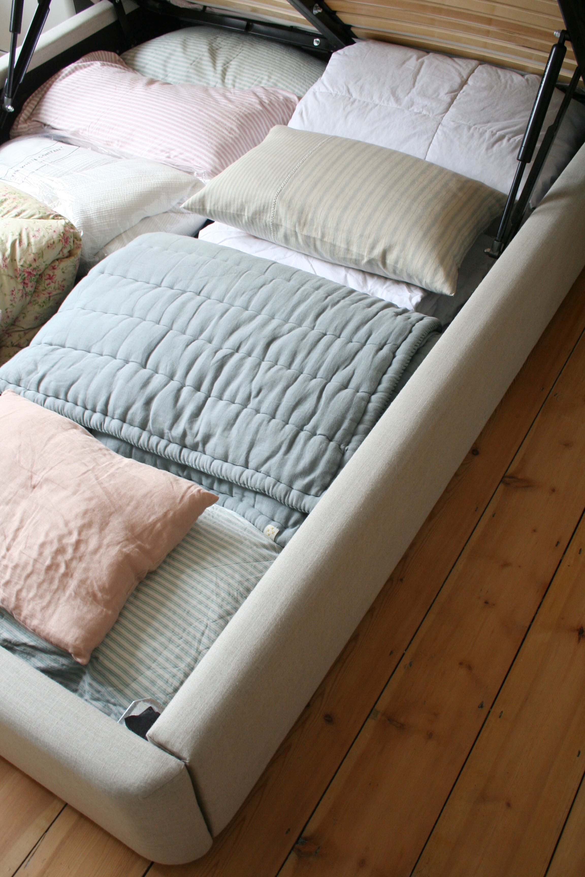
The bed has a gas-lifting top that is very easy to lift and opens to reveal a huge space for storage.

The first thing the staff pointed out was that you need a mattress that weighs at least 35kg to keep the bed shut. I had one of those so that was all good. The next thing they showed me was how to lift up the top of bed and close it again. It takes very little effort to open the bed but it definitely takes effort to close it. However, I have got used to it very quickly and open the bed twice a day every day as we keep Otto’s dog bed in there during the day as there’s not enough floor space in the room to have it out.

Once the bed is open the entire base of the bed is available for storage and you would be AMAZED at how much you can fit in. We have so little built in storage or space for cupboards in our house so this amount of space is a god send. I actually used the space as a makeshift wardrobe for the first few weeks as we had nowhere else to put clothes.

The sides of the base are all beautifully upholstered so there are no nasty sharp edges to bash shins on and the edges also don’t protrude beyond the mattress so it takes up no more space than an average king size bed. This was very important to me as I wanted the bed to take up as little space as possible.

I was totally sold on the idea of the ottoman after my showroom visit and I also left with lots of fabric samples. Whilst I was there I also had to decide on the headboard style. Aesthetically I tend to prefer beds with no headboards but on a practical level it can just be a bit gross as the wall gets all grubby and your pillows end up down the gap between the bed and wall. Therefore, I wanted the most minimal headboard available and the Burdock style is just that: no frills, just a classic shape that won’t date.

I chose the Burdock king size ottoman bed as the headboard is the perfect simple shape for a small room.

The headboard is very comfortable and in terms of comfort you would never know the bed itself is anything other than a conventional bed; the ottoman base makes absolutely no difference to how sturdy it feels. You would never in a million years know that the base is hollow and this all lies beneath…

I chose the linen fabric for the upholstery as I wanted to keep it neutral in such a small room so it didn’t feel too dominant.

My bed is upholstered in Plain Viscose Linen fabric in the ‘Linen’ colour way.

It’s a lovely soft colour that works very well with my new wall colour…

I have recently repainted my bedroom in School House White from Farrow & Ball, which works much better with the natural linen colour of the upholstered bed.

I am so pleased that Button & Sprung introduced me to this style of bed as I had never considered it before. It is working for us so well on a practical level and I really admire the design as it doesn’t feel too big or heavy in such a small room even though it gives us a massive storage space akin to a huge cupboard.

Thank you to Button & Sprung for partnering with me on this post. I would definitely recommend you investigate an ottoman storage bed if you too are struggling with space/storage or if you just can’t help but shove endless stuff under your bed!

Katy x

*This post was written in collaboration with Button & Sprung.

Painting my uPVC front door

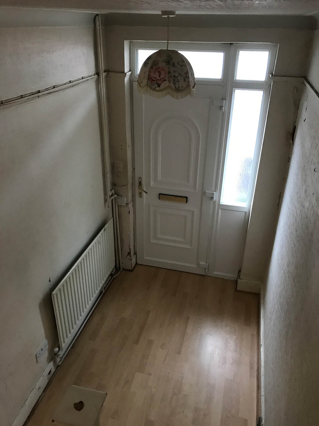
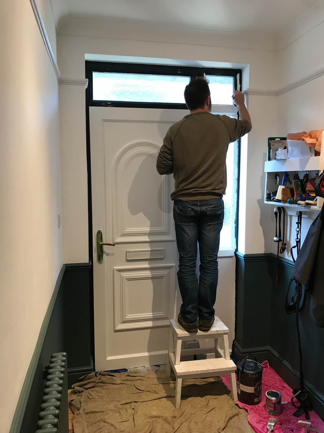
Happy new year everyone! I hope you all had a good break. I don’t know about anyone else but my fave part about the holidays is the time between Christmas and New Year as I get a chance to do DIY and organise stuff I’ve been ignoring the rest of the year. We took this opportunity to figure out a solution to a problem that’s been bugging me since we moved into the house which is our horrid UPVC front door. The door does not match the period style of our hallway so one day I would really love to change it back to an original 30s wooden front door. In the meantime, however, I have been desperate to find a way to improve the way it looks from the inside without spending much (absolutely no point in doing anything to the outside yet as that would be the very definition of polishing a turd! The brown pebble dash frontage and rotting fence have to be sorted first before anyone can even think about the front door). The door is a very cheap one with unpleasant mouldings and no glazing so it’s a big solid lump of white plastic and the sheen of uPVC is perhaps the thing I like least about it. We have uPVC back doors and windows throughout the house, which don’t bother me at all (in fact, I’ve grown to be very grateful for them as they are so effective) but the front door is such a large lump of the stuff that I just can’t bear it anymore. I just don’t want those faux period mouldings in my life!

We talked about paneling over the door and other impractical solutions like that and the only sensible thing we could come up with was to paint over the door in a very dark colour that would make the mouldings disappear and remove the sheen of the uPVC. But you can’t paint over this type of surface…right? Wrong! We’ve done it. It’s a triumph and I could not be happier with the results. Ronseal had asked me to choose a product for a DIY project I was doing at home so I chose their One Coat All Surface Primer and Undercoat with the intention of transforming the inside of our front door and beginning the process of making our hallway feel and look better. It worked so well and we went over it with a very dark blue satin paint left over from our kitchen cabinets so we’ve made a big difference with very little cost.

Ronseal uPVC primer on front door

Let me chat you through how we did it and what it used to look like…

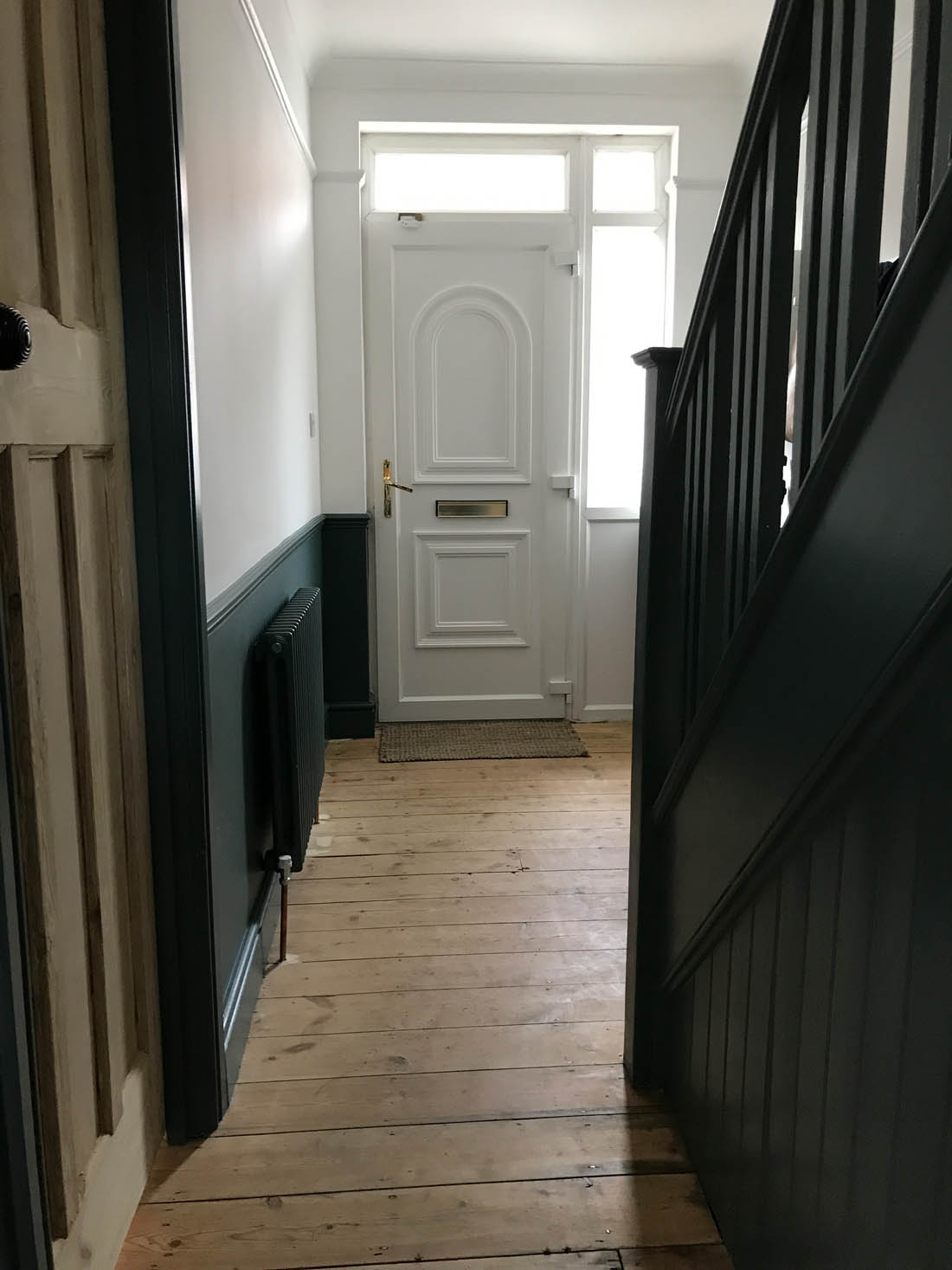
You can see more of what the hallway looks like in this post and whilst I am very happy with the paint colour, the introduction of a dado rail as well as dipping the original internal doors the front door just stood out like a sore thumb. Almost as bad as the uPVC was the gold plastic letterbox 😉 There was no point painting over the white plastic in any colour other than a very dark one – as the dark colour is what would help make the mouldings far less obvious – and I thought choosing the wall colour would be a bit overwhelming so I went with the same paint as we choose on our kitchen cabinets (you can see details of my kitchen here). However, a primer suitable for uPVC was essential to make sure the paint adhered to the shiny surface of the plastic.

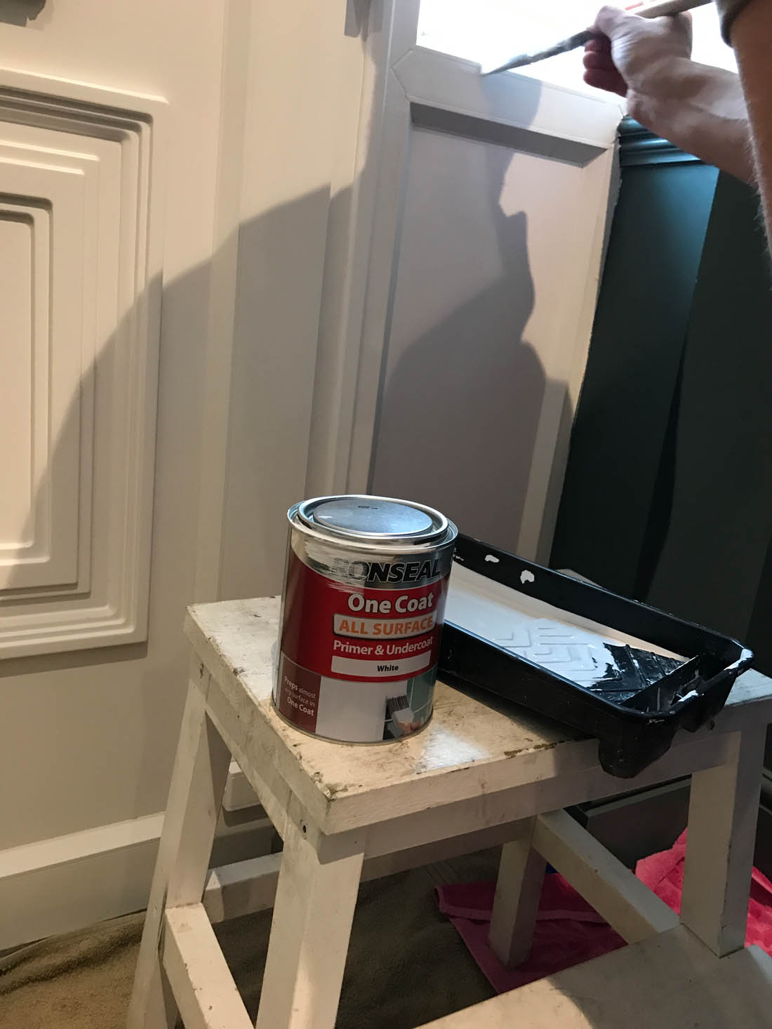
Ronseal all surface primer

We prepped the door with Ronseal’s One Coat All Surface Primer and Undercoat after a light sand and clean. The primer was very easy to apply and it did only need one coat.

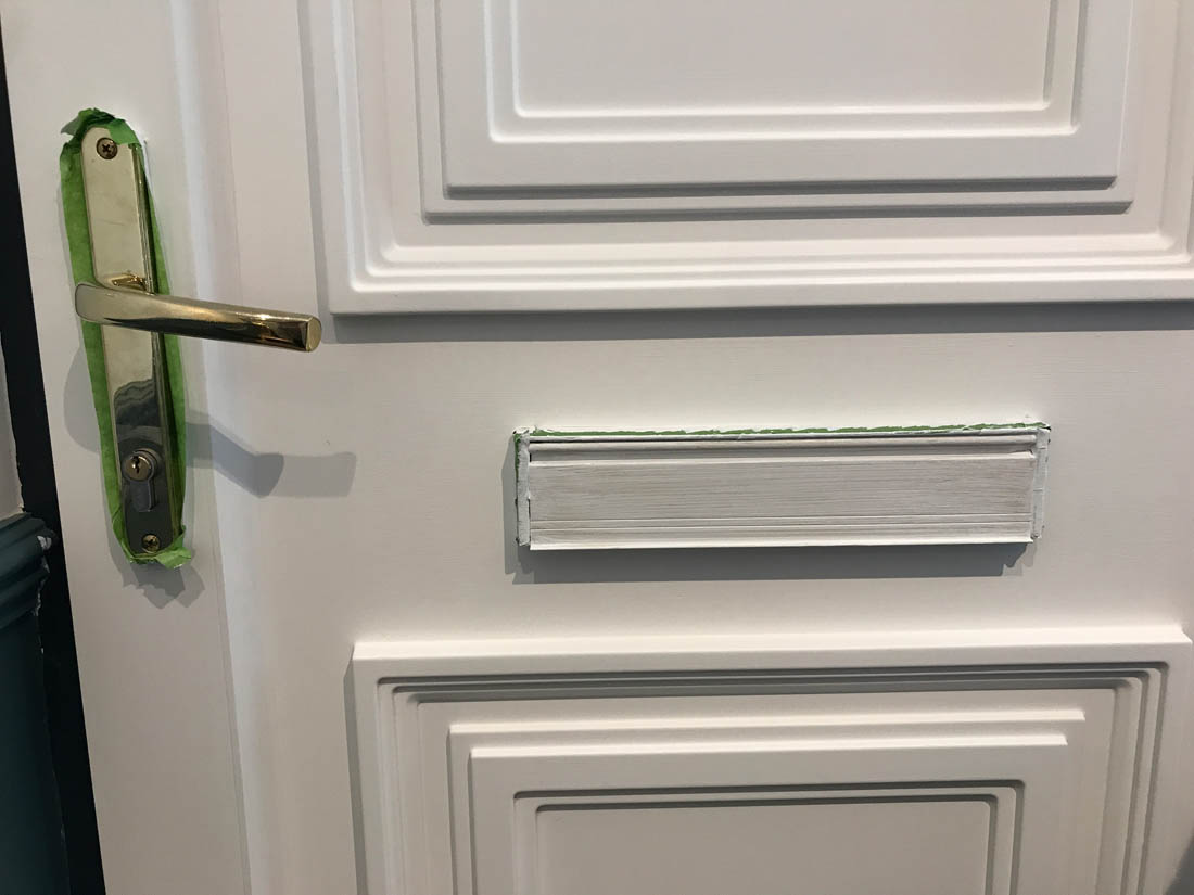
We also decided to prime and paint the gold plastic letterbox and we may replace the handle for a dark one too but we didn’t think it was worth painting it because of the wear it gets.

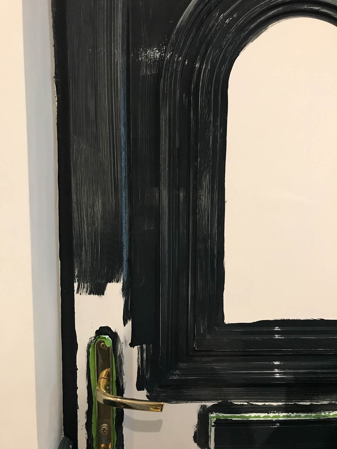
This is what the door looked like before we went to bed that night and we waited until the morning to do the second coat.

After the second coat the door looked like this and the shine of the satin paint could be seen making the door look more like a painted wooden one rather than a plastic one. We did end up with lots of brush strokes in the paint so it definitely wouldn’t be classed as a professional paint job but I really don’t mind as it makes it look and feel a bit less pristine, which is part of what makes it stick out like a sore thumb when contrasted with the old floorboards.

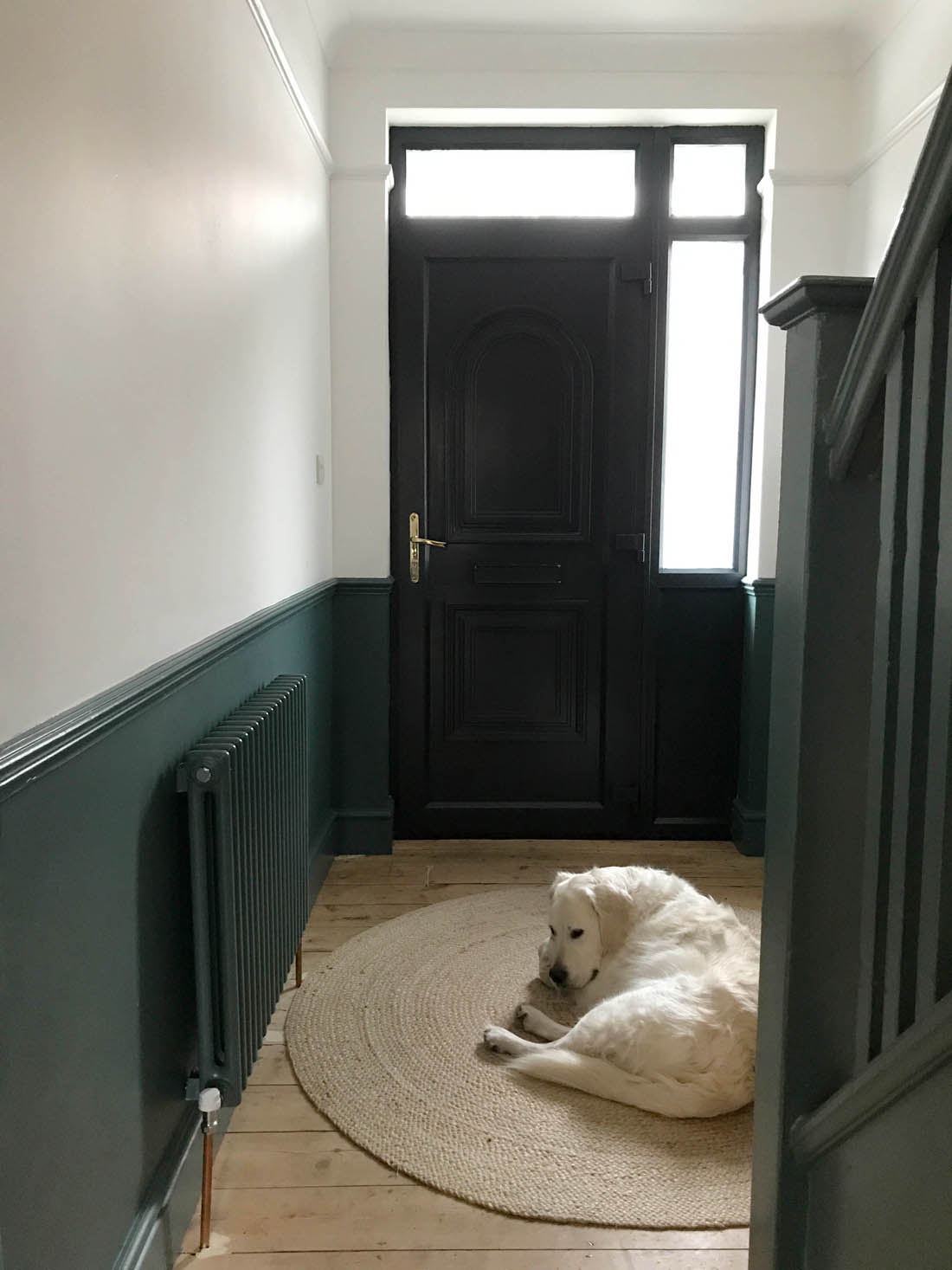
And here is the finished door…

As you can see, the mouldings are far less obvious in the dark colour and I think the colour works well with the period feel of the dado rail and wall colour. Being able to paint over the letterbox has also made a big difference, in my opinion.

I am delighted with the results and the texture of a painted door rather than a plastic door is such an improvement! I’m amazed how easily we were able to paint over the uPVC and it’s just the temporary fix I was looking for before we can afford to fit an original 30s door. I’ve now got my eye on a lovely big round mirror to go on the left hand wall and a ceramic wall light to soften the light in here as the spotlights are hellish. After that we need some prints and storage furniture but all in good time.

What do you think? Be honest!

Katy x

*This post was written as part of a paid collaboration with Ronseal.

My bedroom update

*Update: My bedroom has change a lot since writing this post! See it more recently here.

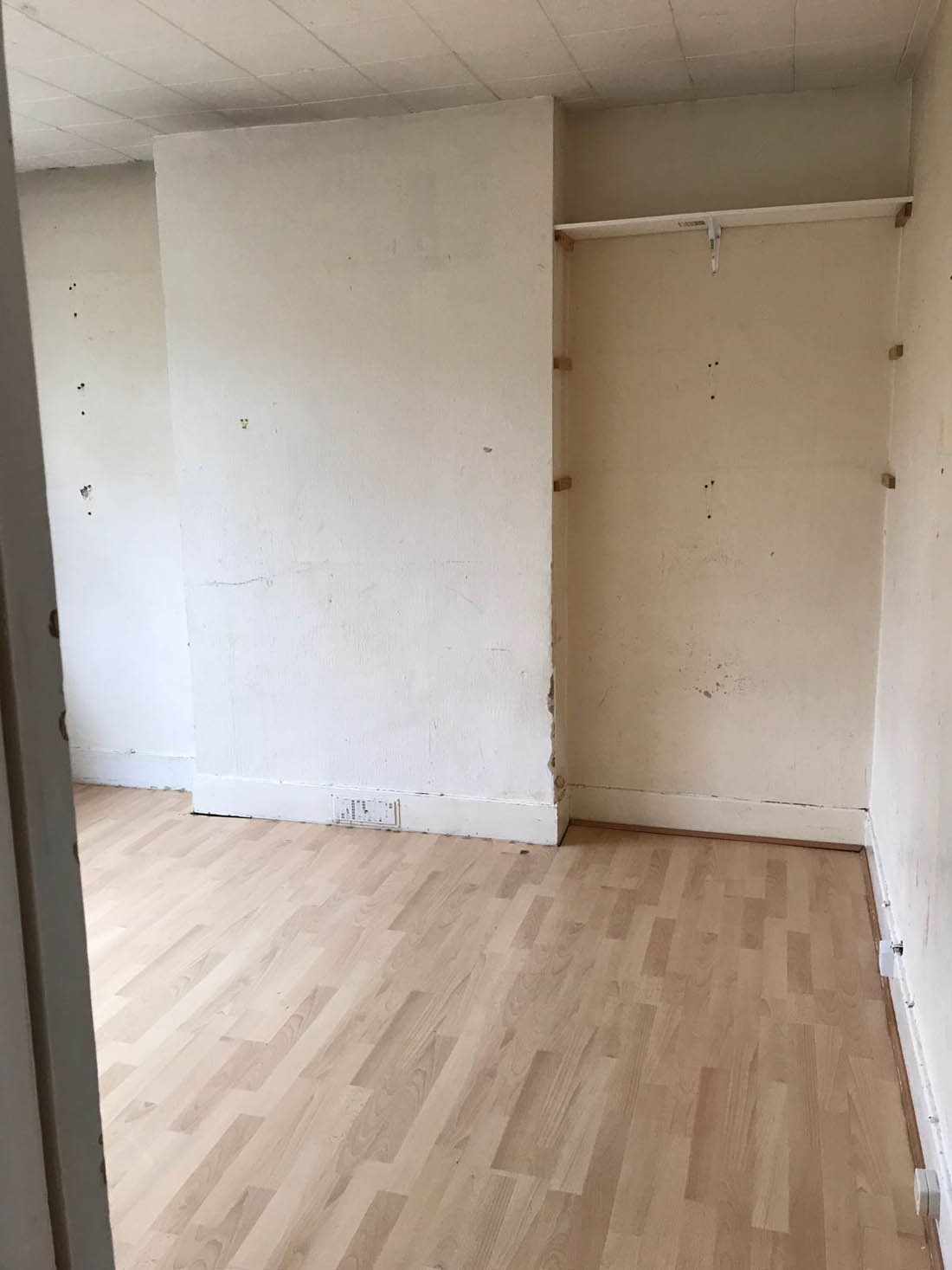
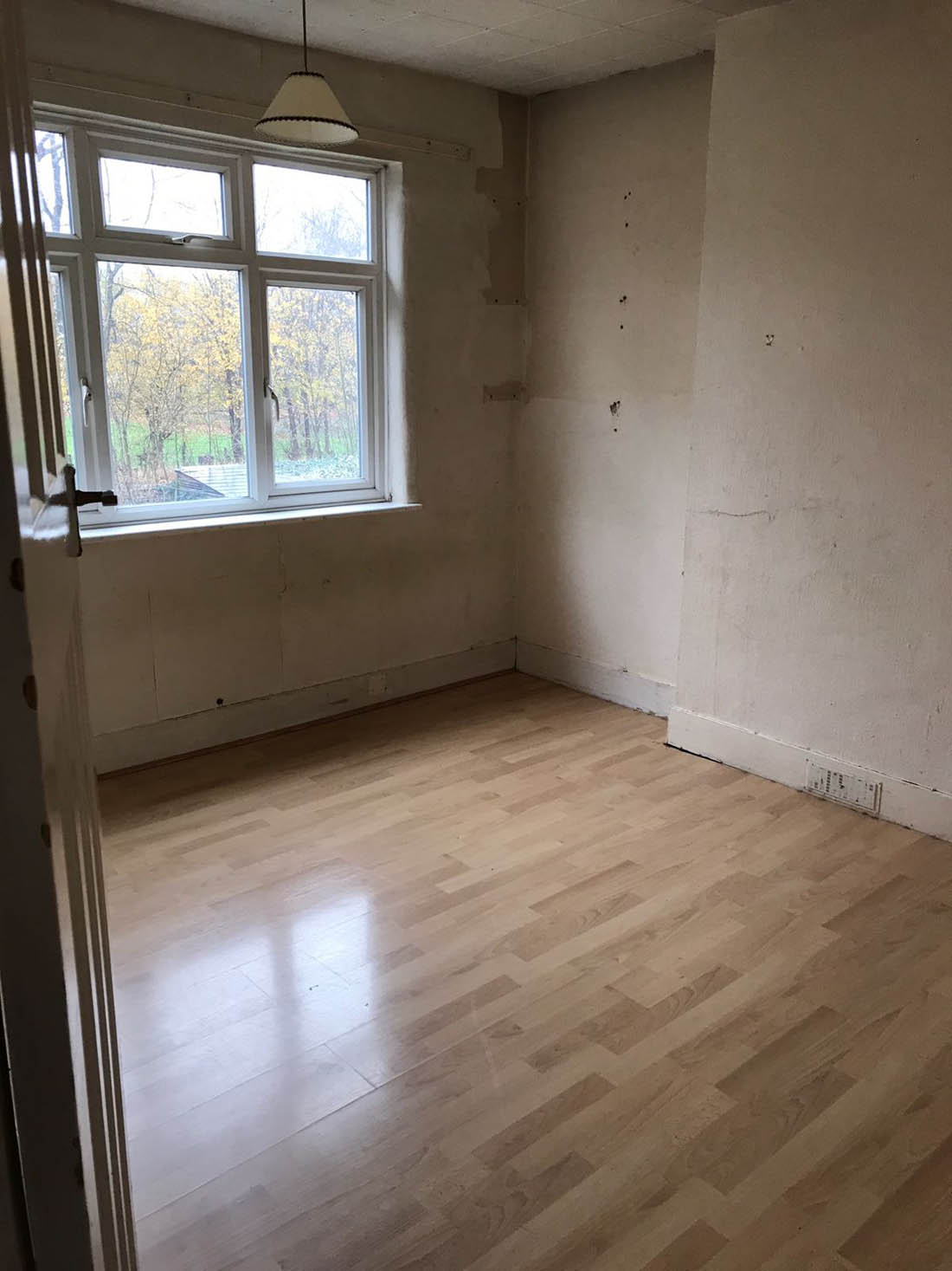
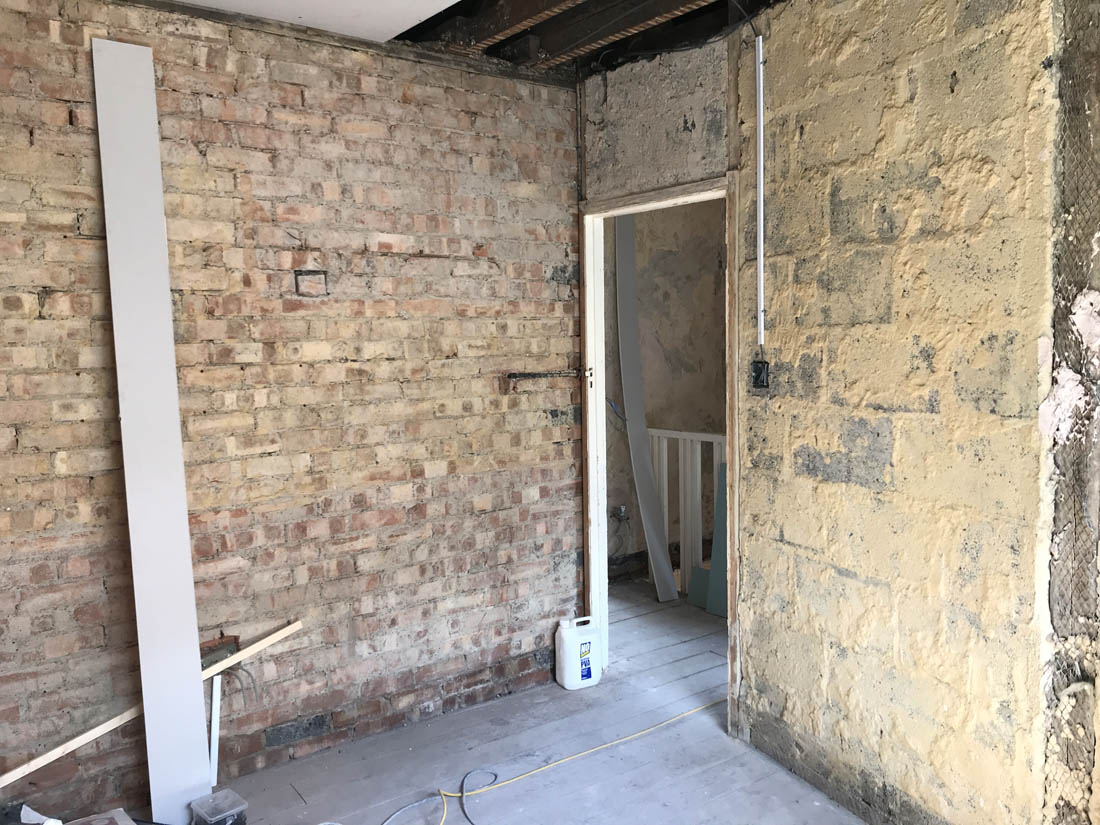
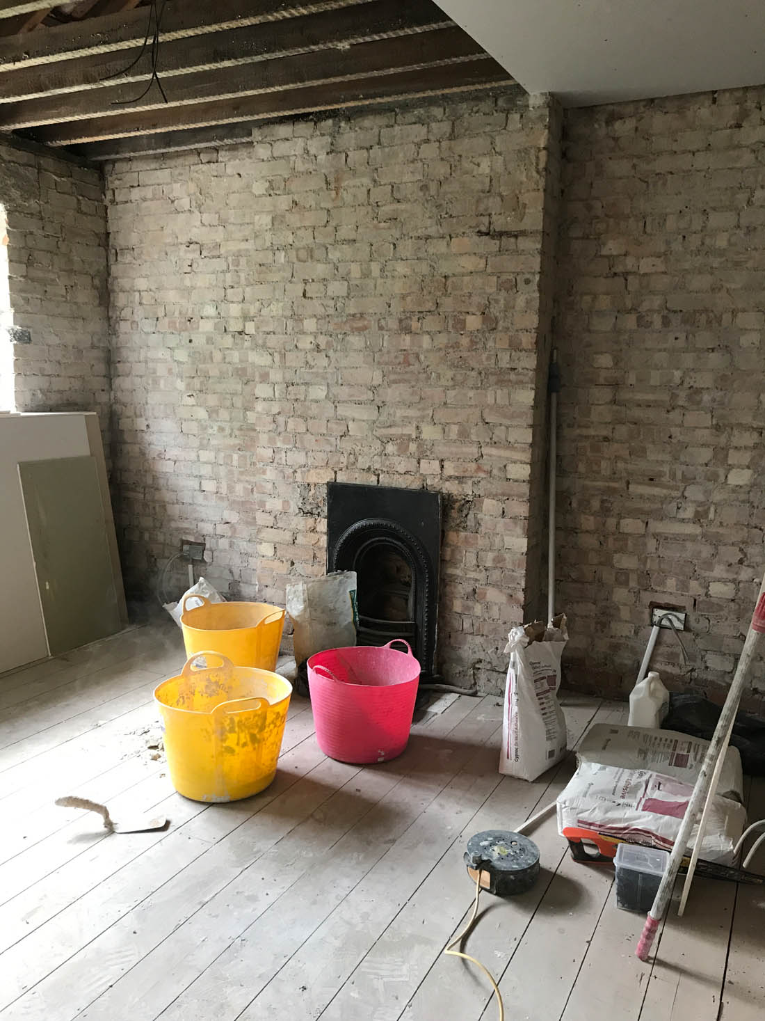
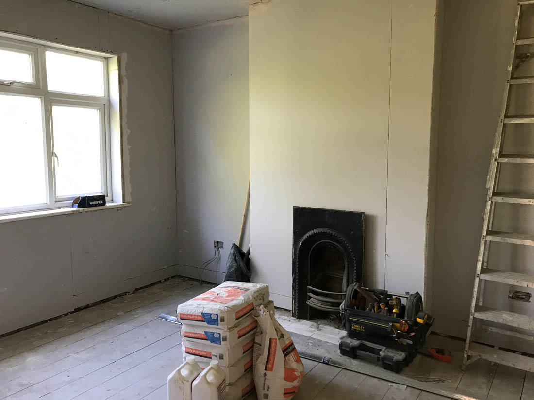
My bedroom is the room in the house that I have been struggling with the most. I think that is because we want fitted wardrobes in both alcoves and until we can afford them we have got a makeshift rail and a chest of drawers that we don’t intend to keep in here so I don’t feel like I can commit to making decisions as it all feels quite temporary. Also, I can not for the life of me decide on bedside tables and am going back and forth, back and forth so the room feels very unfinished. Saying all that, we have come a long way in this room, especially when I look back at what the room looked like when we viewed it…

And what it was like once emptied…

And during the works…

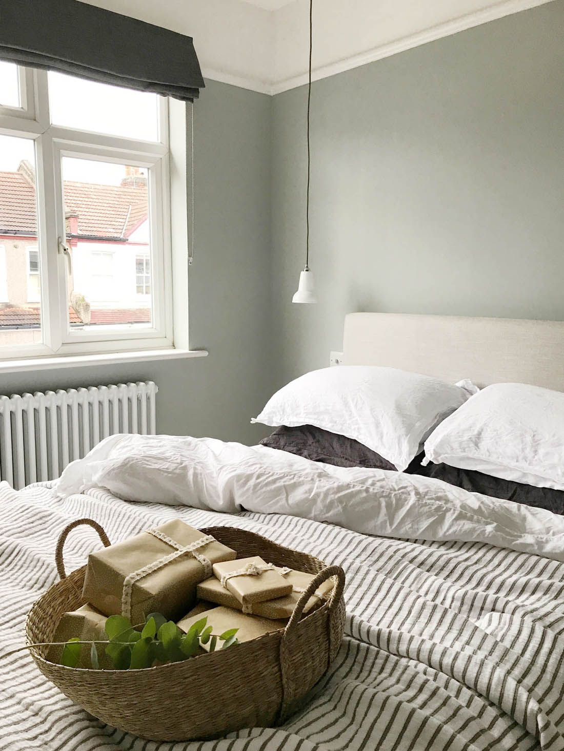
Compared to what the room was like I am very pleased with where we have got to so far…

Basically, I love the bed (such a fab ottoman bed from Button & Sprung that is loaded with clothes in the absence of wardrobes – I will do a full blog post about it because I wish I had always had one of these), the bedding, the lights, the fireplace, the radiator, the colour of the walls (although I regularly think about changing it already!!) and the mirror. In order to make the room feel more ‘me’ and to make it work better on a practical level the alcoves need inbuilt cupboards, the walls need artwork and pictures, I must make a decision on bedside tables one of these days and I need a piece of furniture on the wall on the left as you come into he room. But, you know what? All in good time. I hate rushing decisions on these things as I always regret it and I know I will find exactly the right things if I am patient. Watch this space!

In the meantime I have added a few little Christmas touches to the room that were kindly gifted to me by Cox & Cox and I have taken a few snaps to show you how the room looks at the moment…

I salvaged the fireplace from another local 1930s house and I’m so pleased with the character it has added to the room. The vintage bevelled mirror is from Cox & Cox and it fits the period of the house so well. I also love the Christmas lights which Mimi loves and every morning asks for ‘Christmas lights on! Christmas lights on!’

The ottoman bed (Burdock headboard in Linen coloured plain viscose linen fabric) from Button & Sprung is proving to be the perfect choice for this room as it gives us SO MUCH extra storage. I’m not sure what we would have done without it to be honest. The bedside lights are made by Anglepoise and made of ceramic so they emit a lovely soft light. The room is very small so we need smallish bedside tables, which is why we wanted to save space with these lights instead of table lamps. I look forward to finding artwork to go above the bed and finally settling on some bedside tables!

I bought the blind from John Lewis and it is the Steel linen black out Roman blind. I think it’s a good choice as it doesn’t take up lots of space in this small room. It also ties in well with the charcoal light cables, pillow cases and the stripe on the quilt (also from Cox & Cox but no longer available). This quilt has totally changed the way I see the room and made it feel so much better. I alternate the white linen with the beautiful rose coloured cotton bedding from Bedfolk that you can see on my Instagram.

The wall colour is Light Blue from Farrow & Ball and all the woodwork and above the picture rail is brilliant white.

A makeshift rail and chest of drawers fill the alcoves at the moment but we have two original 30s doors from the house that we will use to make fitted wardrobes.

Baskets | Wrapping paper | Tassle ribbon 

I am  in LOVE with these shallow baskets (see a selection of the other equally beautiful baskets here) that are going to be so useful around the house and they are a great shape for everything from blankets to toys.  I’m going to use them to put the presents in under the Christmas tree.

So, lots to do but all the fun stuff! I really look forward to adding to this room over the coming months and making it much cosier and more practical.

Katy x

Mimi’s room before and after

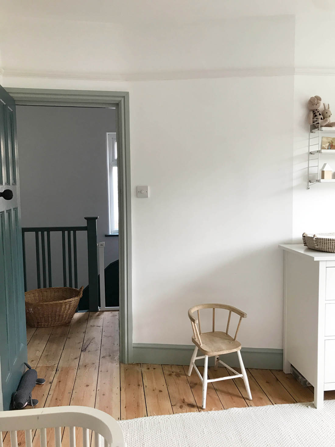
I’d say Mimi’s room is the only room in the house that is basically finished. The reason for this is that we pretty much lifted everything that was in her old room and placed it all in this new room and it all fitted and worked really well. In fact, the paint on the woodwork is what we used in her nursery in our flat and is what inspired me to use it throughout our new house as I loved it in her room so much. The only real difference in here is that the daybed has moved to our third bedroom and I have to say that we really miss it in here as it was where we would dress her and give her milk and read stories before naps and bedtime. Before long though the Sebra cot will extend into a junior bed so we can use that instead.

Other than that we have kept the room very neutral and there are a couple of blank walls that we can add to with book shelves and height charts and things like that. The only addition we have made is the linen canopy above her cot that my mum bought Mimi for her 1st birthday and she loves it and I love the burst of colour it adds to the room.

Have a little look for yourselves…

Sebra rose canopy | Sebra cot | Vintage shelf | Hot air balloon light | Whale (no longer available but this is a close match) | Sausage dog | Luggy trolley

Princess and the Pea print | Elephant | House cushions | Animals book | Rug

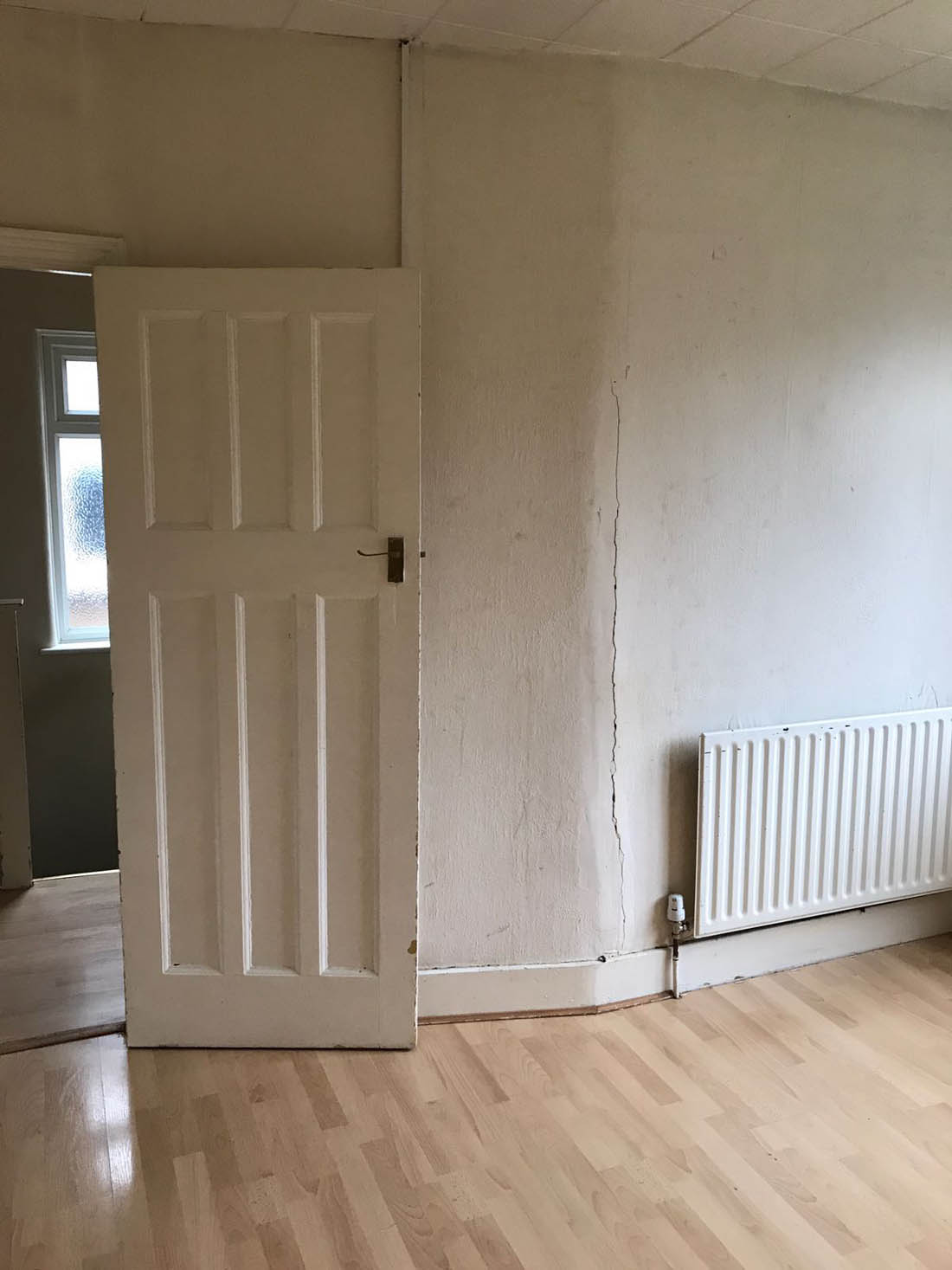
We removed the laminate throughout the house including this room and as you can see above the walls were in a pretty bad state and there were foam tiles on the ceiling. There was only one electric point, the ceiling light was right next to the window, the radiator was in the wrong place and it all needed gutting.

One of the things that I wanted to do to bring some character back to the room was to knock out the fireplace as we uncovered the original tiled hearth when the laminate was removed. I actually got the fire insert from eBay for £30 (it’s Victorian, not 30’s) and didn’t bother with a surround as it’s a small room and the insert did exactly what I wanted without the need for a surround. The room is painted in brilliant white with Light Blue woodwork and the outside of the door is Inchyra Blue. The floorboards were sanded and finished with Osmo Raw oil.

Chest of drawers | Vintage chair | Print | Curtains from our old house – made to measure by John Lewis | Radiator

We completely re-plumbed the house and replaced all of the radiators as well as moving them to below the windows. I’m really pleased that we chose to spend the extra for traditional style ones.

A big difference was made by re-hanging the doors in all the rooms so that they opened onto the walls instead of out into the rooms. I also love that you get a glimpse of the Inchyra Blue from the hallway when the door is open.

Before

Changing basket | Pocket string shelf

And this is what the room looked like during the works if you are interested. In terms of the structural work we did in here it was taken right back to brick and the ceiling was pulled down.  The window lintel had to be replaced, the room was replastered and we replaced the skirting, picture rail and architrave. Take a look…

All plaster was removed.

The ceiling was removed and rebuilt and the fireplace was knocked out.

Plasterboard then went up.

The room was then beautifully plastered.

And decorated.

Our builder also sprayed the fire insert with a matt black paint that gave it a really nice finish.

So, there you have our one finished room! Hope you like it.

Katy x