Our unfinished hallway and need for storage

I hope you enjoyed having a look at our living room last weekend and as promised I want to show you the hallway today more than anything to gee me up to get this space looking and feeling a bit more finished and homely as it feels neither of those things right now.

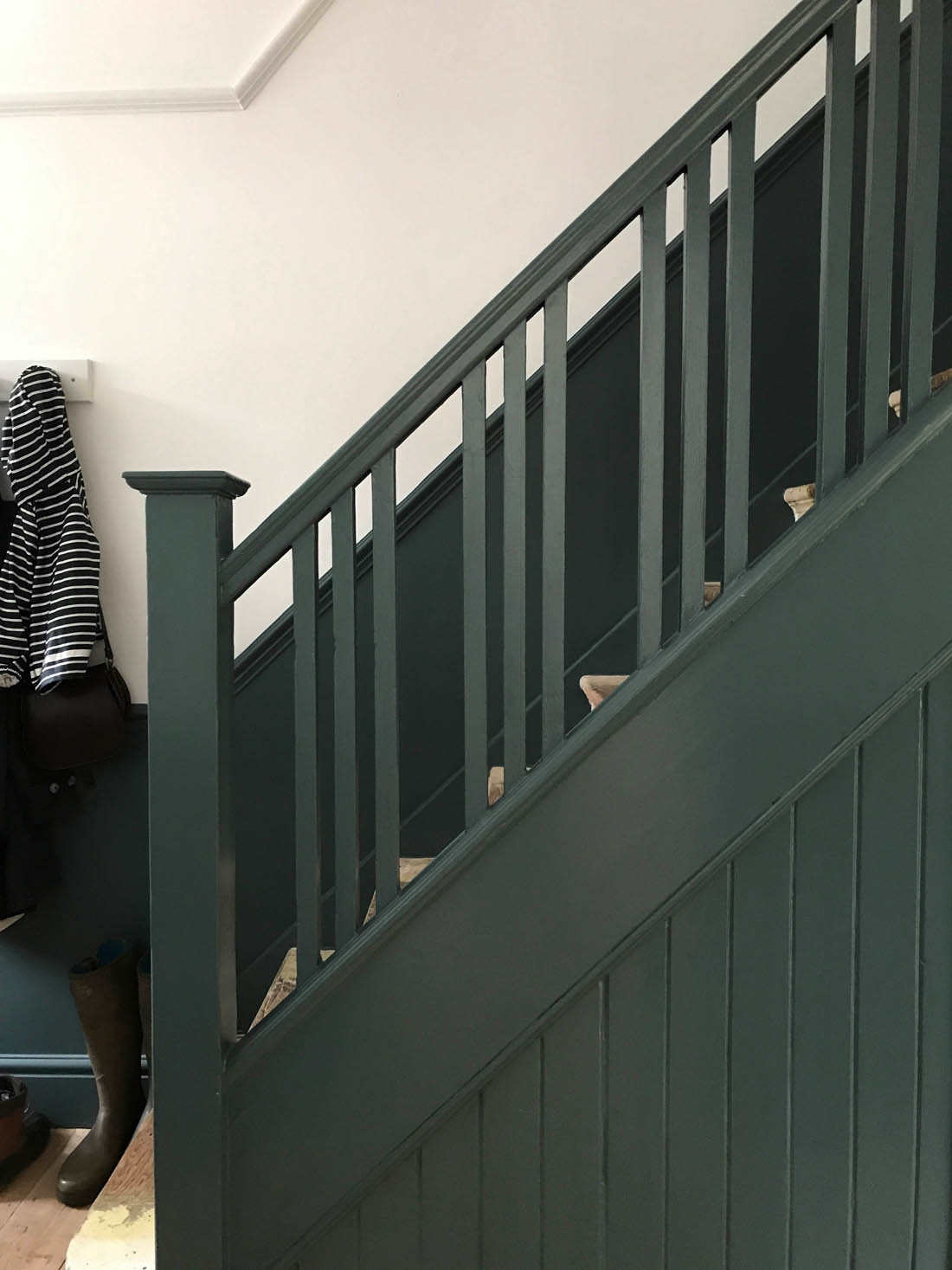
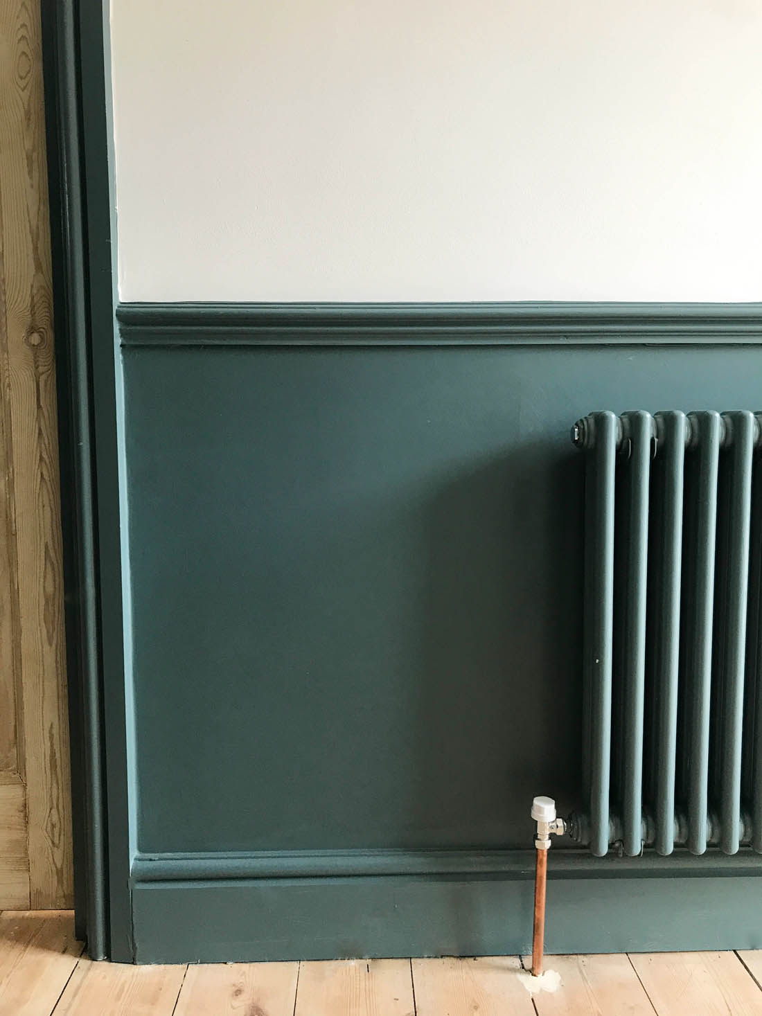
I absolutely adore the colour that I chose for the hallway, which is Inchyra Blue by Farrow & Ball (they kindly gifted us just the paint for the hallway – not the rest of the house) and I love how it emphasises the beautiful original banisters and I chose to install a dado rail, not original to the house, to add even more of the colour (as well as hide mucky hand prints and dog scuffs). I also love the original internal doors that I chose to leave natural and I think the tone of the wood works really well with the blue (actually more green in this space).

However, the stairs are waiting for a carpet that may be a long time coming as it is SO expensive to carpet stairs and this makes the hallway feel and look very unfinished so I think we will paint them in the meantime (probably Railings, the same colour as our kitchen). Another problem is that we have a lot of shoes and boots to contend with so we are desperate for some storage as all we currently have are some hastily mounted pegs and a shelf from the old flat that don’t look great.  A lovely 1930s bevelled mirror and maybe a rug like this one and we’ll all be feeling much better about the space, I’m sure. In the meantime I’m going to show you some storage pieces from the Wooden Furniture Store that would work well in a hallway as they are kindly sponsoring this post.

Before and after

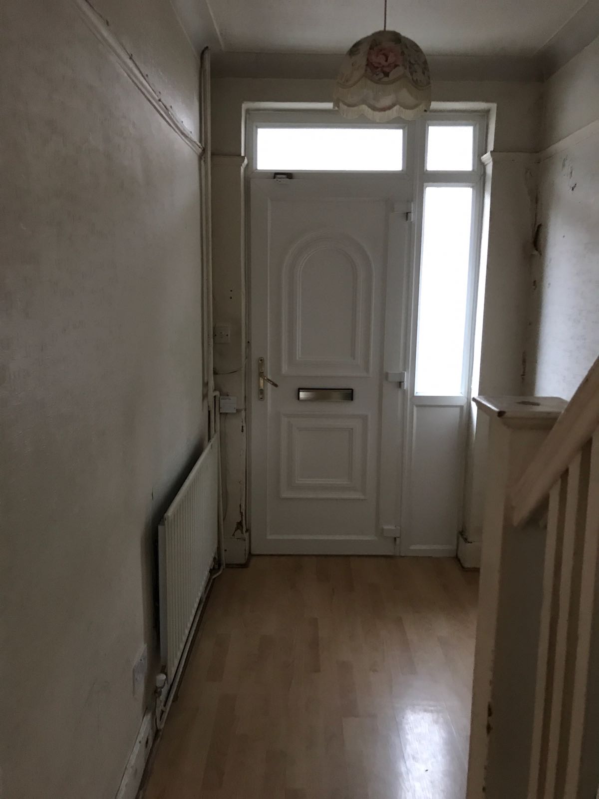
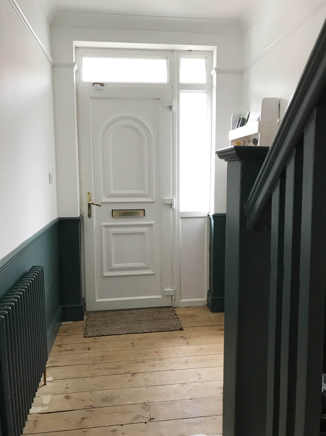
Just to give you an idea of what the hallway was like when we bought the house and how it looks today…

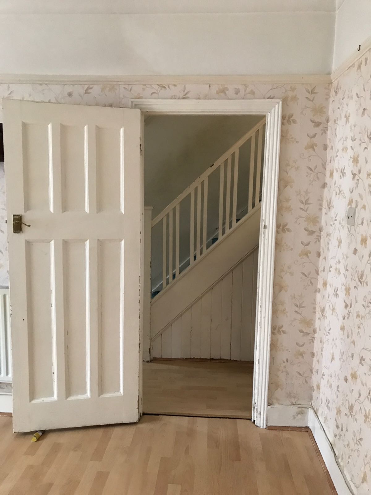
The hallway was very, very tired with peeling wallpaper, a horribly dirty green carpet, the woodwork was chipped and battered, the walls were filthy, the plaster was shot and the doors were painted. We completely stripped the place back to brick, replastered, re-wired with spot lights (which I HATE but we’ll talk about that another time) and re-plumbed and installed a new traditional style radiator that we painted the same colour as the walls. We had the picture rail, architrave, skirting and coving replaced as it was but I also added a dado rail, which I love for the style and practical benefits. The doors were dipped and left natural on this side (they’re painted on the other side in the living room) and I bought new handles.

My greatest sadness when we bought the house was that the previous owner had taken out the original front door. All of the other period features in the house were left alone and I was fine with the fact that that windows are uPVC but the front door makes me weep. However, as it is purely aesthetic it got pushed to the bottom of the list when it came to how we spent our renovation budget.

Future plans

This is the only storage we have as it stands – just a cheap peg rail and wall shelf that we brought from our flat and nothing for shoes and boots.

We will be carpeting the stairs in this sisal, which from previous experience is amazingly hard wearing and does not show up the dirt and wear like wool carpets can. We will also replace the front door and its frame with an original 1930s one like this, which will totally transform the feeling of the space as well as letting in more day light. For now though we are going to focus on less expensive and more practical pursuits like figuring out the storage, which I know will make this hallway a very useable and useful space.

Taking inspiration from the hallway furniture at Wooden Furniture Store, I am thinking of a storage bench that we will be able to sit on as well as storing shoes and boots. The other option is a dedicated shoe cupboard, which we may be able to fit alongside a bench as very soon Mimi’s buggy won’t be needed (sob!) so we will have extra space and she will no doubt have more shoes.

I really like having a wall mounted set of cubby holes that can be used to store mail, keys, dog leads etc. Even though this wall shelf with pegs isn’t intended for the hallway it would be perfect or a more conventional wall mounted set of coat hooks is very useful, especially if it has a shelf above.

I had ruled out a console table as I had in my mind that it wouldn’t enough storage for us but looking at this one it could work for shoes below and then all those bits that just need to be shut away in a drawer and forgotten about 😉


We will also be painting and organising the under stairs cupboards as our next job so watch this space for progress on that (our weekends are soooo fun at the moment!).

During

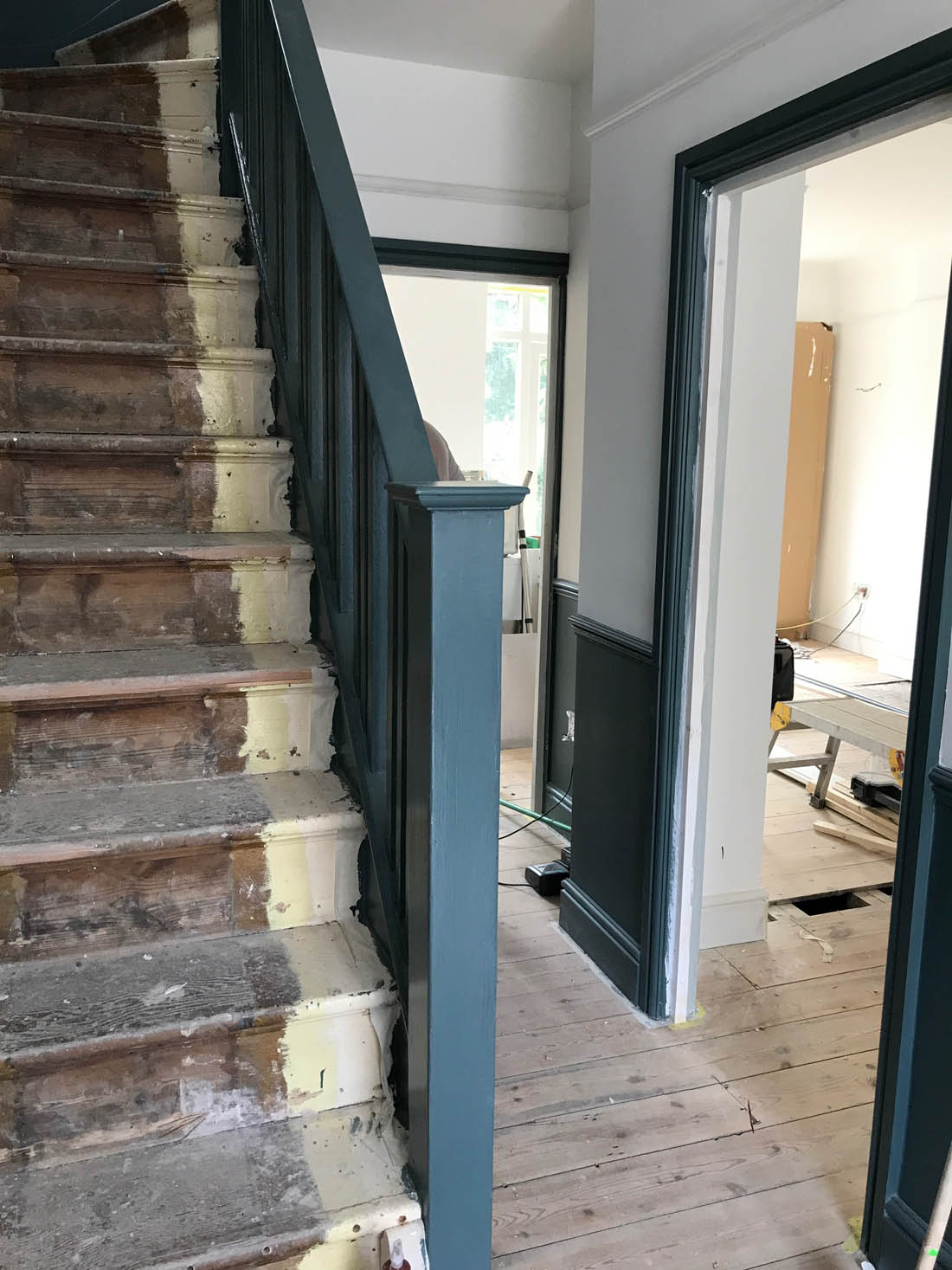
And just to give you an idea of what was involved in getting smooth walls, restored doors, a new radiator and re-wired lights in our hallway here are the ‘during’ pics…

So, there you are. If anyone has an extra couple of thousand pounds floating around fling them my way for some carpet and a new front door – ha!

Katy x

*This post was kindly sponsored by the Wooden Furniture Store.

Living room progress so far

Right. I’ve finally bitten the bullet and taken some snaps on my iPhone around the house to show you how it looks so far. Usually I don’t feel very comfortable sharing a room until it is finished but this house is going to be an ongoing project for us over years rather than weeks and months so even though it doesn’t look how I would like it to yet, I want to show you around now and tell you about my plans for the future. It’s certainly not a flashy or highly styled interior, mostly dictated by my simple taste but also ruled by our restricted budget. Basically all of our funds went on bringing this house back to life and up to date structurally so there wasn’t much left for furnishing the house other than what we were able to bring from our flat (well, the items that fitted as our bed and sofa didn’t!). Anyway, I’m totally happy about not being able to make it ‘perfect’ from the start as I really do think the best interiors grow organically over time and there would be no fun for me if it was all done – what would I possibly have to do if I wasn’t continuously making plans about what to add or takeaway to each room? 😉 Also, I haven’t put anything on the walls yet really so that is all to come too.
I thought it would be useful to work through one room at a time on the blog so I’m starting in the sitting room that has now been knocked through to the dining room and kitchen to make one large room downstairs but I will show you those two spaces separately as there is too much to say in one post.

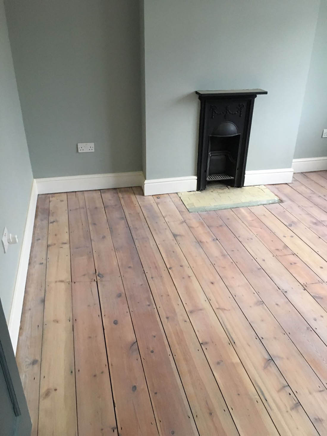
Throughout the house the walls and ceilings were taken back to brick, re-plastered, re-wired, re-plumbed, painted and new picture rail, skirting, architrave and coving were added (we tried to make these as close to the originals as possible). We also removed the laminate sheeting and sanded the original boards. One day I would like a new wood herringbone floor as although I like the way the original boards look the floor isn’t insulated and can’t be except at massive expense as there is a four foot chasm under the house. Also, when the uPVC windows are due to be changed I would replace them with grey/black uPVC (as we’ll never be able to afford to reinstate wooden windows).
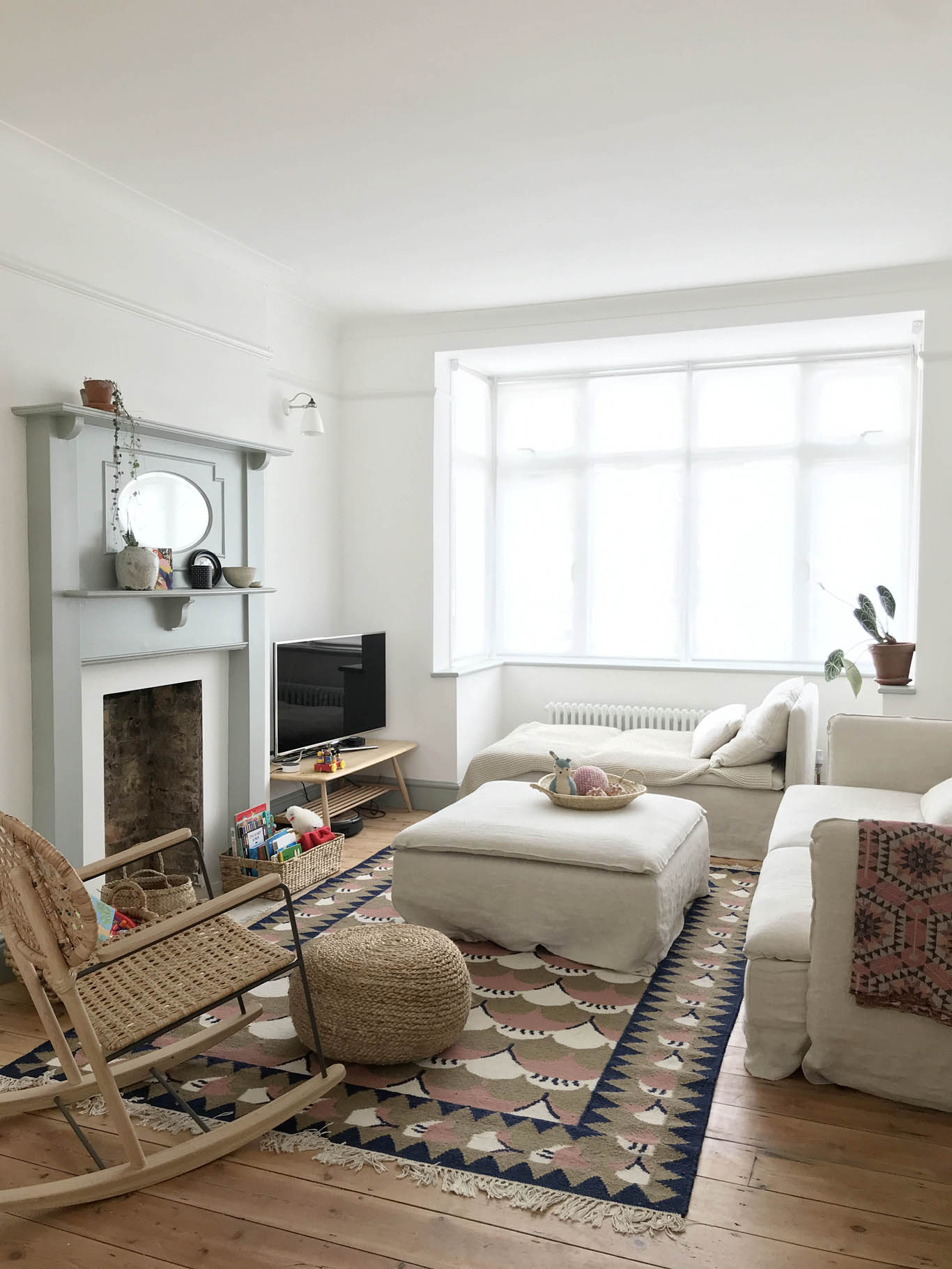
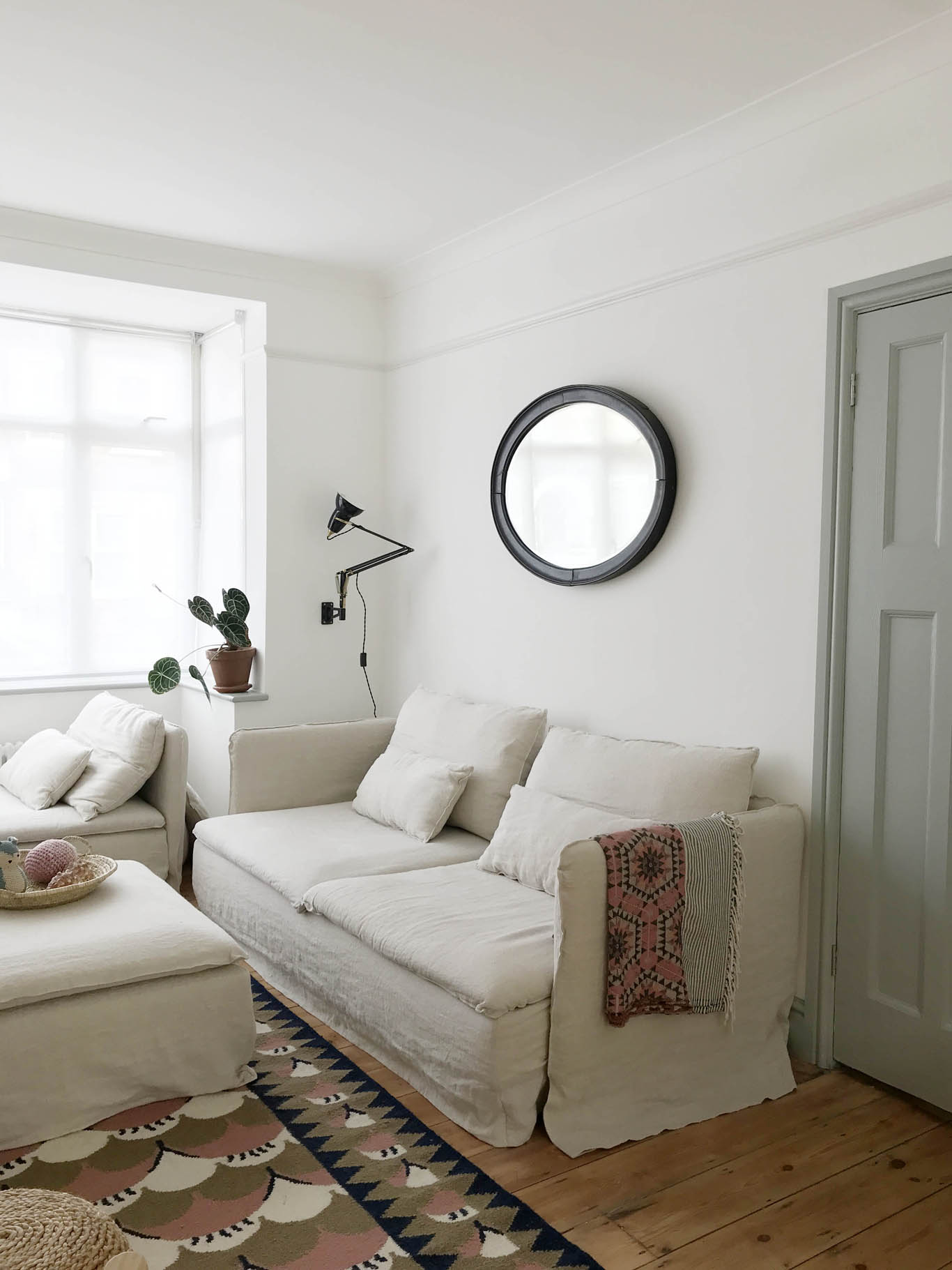
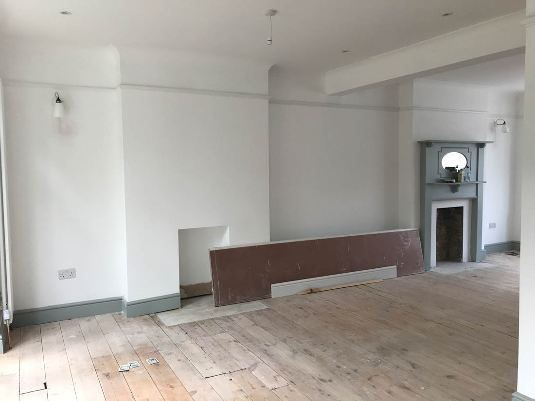
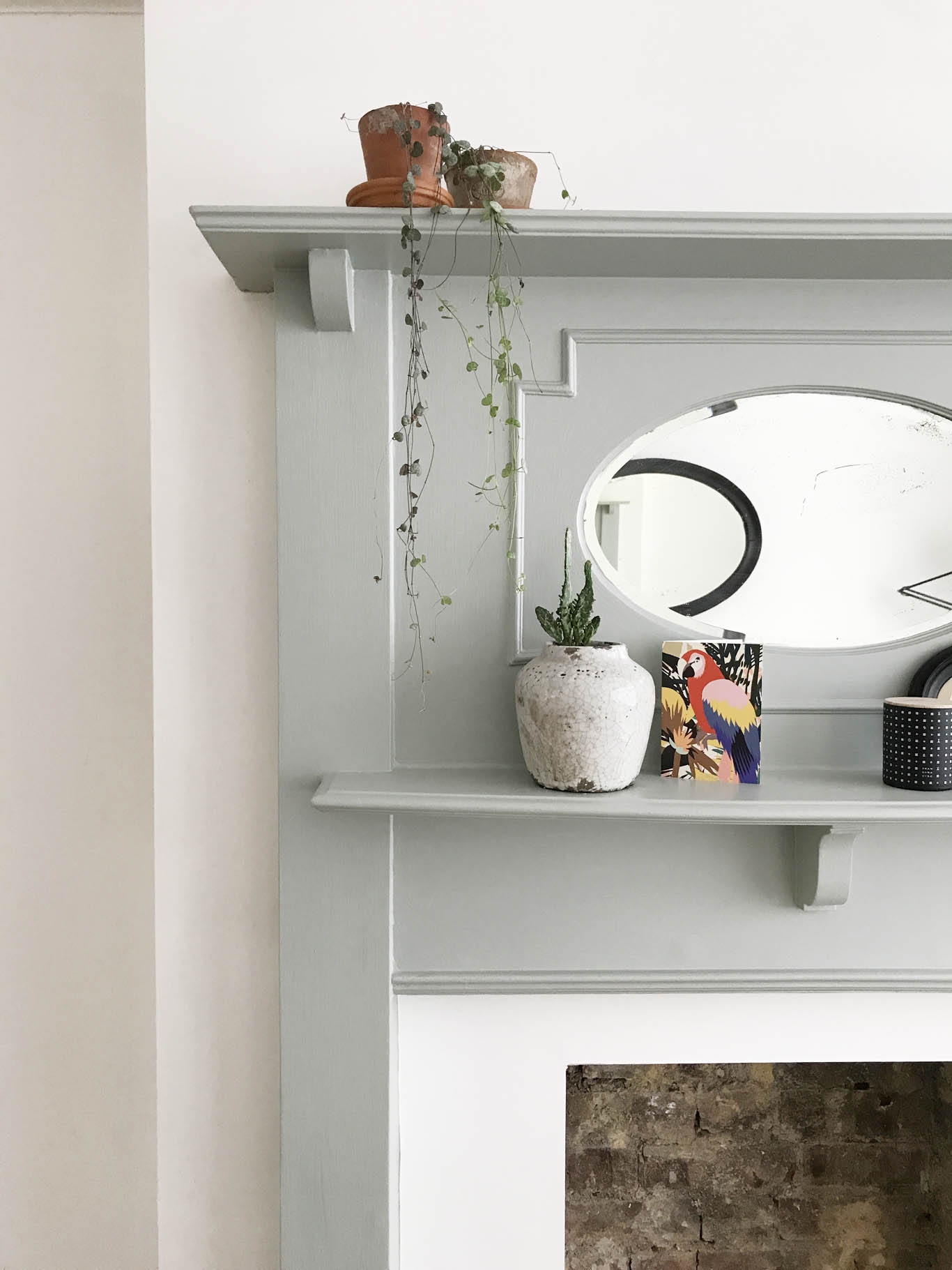
So, for now, the sitting room is quite pared back with brilliant white walls, Light Blue woodwork, an original 1920/30s fire surround that I bought from eBay for £60 and that was painted in the same colour as the woodwork. We still need to choose tiles for the hearth and I’m loving the Claybrook studio range and colours.

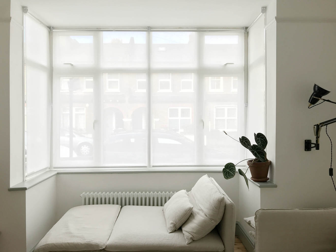
We hung sheer blinds at the windows to maximise the feeling of space and light. The radiator was moved to under the window and we chose traditional column style ones to help add to the period feel of the house. I chose not to have an overhead light in this room as I just never, ever use them and instead we have wall lights in the alcoves from Original BTC and the black angled one that you can see in the previous photo is from Anglepoise. They are all wired in so that they can be dimmed and turned on and off from the light switch on the wall by the door as you enter or leave the room. The wicker rocking chair is from Ikea and is likely to change at some point and we hope to have in built cupboards in the alcoves for the tv to sit on etc.

The main decision I had to make before we moved was choosing new sofas for this room as our old sofa was 4cm too long and the shape woundn’t have worked in the space. I knew I wanted really big comfy sofas to make the room feel welcoming and cosy but we had very little to spend. I had seen the Soderhamn range of sofas from Ikea in lots of lovely houses on Instagram but I wasn’t massively keen on the covers they are sold with as the colours weren’t ideal for the room but the price was ideal. For the three seat sofa at £450 and £295 for the chaise in the window I think they’re quite a bargain (NB the matching footstool is no longer sold in Ikea in the UK so I bought it on eBay for £50 – just search for Soderhamn footstool). I came across Bemz years ago when I didn’t have an Ikea sofa and thought their business idea was a brilliant one – they make bespoke covers and legs for any Ikea furniture so that you can personalise your sofa or armchair. They were my first port of call when I decided on the Soderhamn sofas as I knew a set of their linen covers would transform the look of the sofas and in turn the room itself. Bemz very kindly sent me a set of covers to showcase on my blog but had they not I would have bought them myself. I absolutely LOVE them. Some may think I am mad choosing the natural linen covers with a dog and toddler but these covers are fully removable and wash at 40 degrees. I’ve already washed them after Mimi climbed up onto the chaise with muddy wellies on and I can confirm that they are so easy to wash (there’s very little bulk to the fabric so they fit in the machine easily) and when you put them back on it is not a tight fit like it can be when you wash Ikea sofa covers. They don’t lose their shape or colour – you would never know it’s been washed basically. I will write a full post dedicated to them and photograph them in more detail, which will helpfully answer all your questions. In the meantime, for those of you who would like to know, my covers are the Loose Fit Urban covers in Rosendal Pure Washed Linen Unbleached.

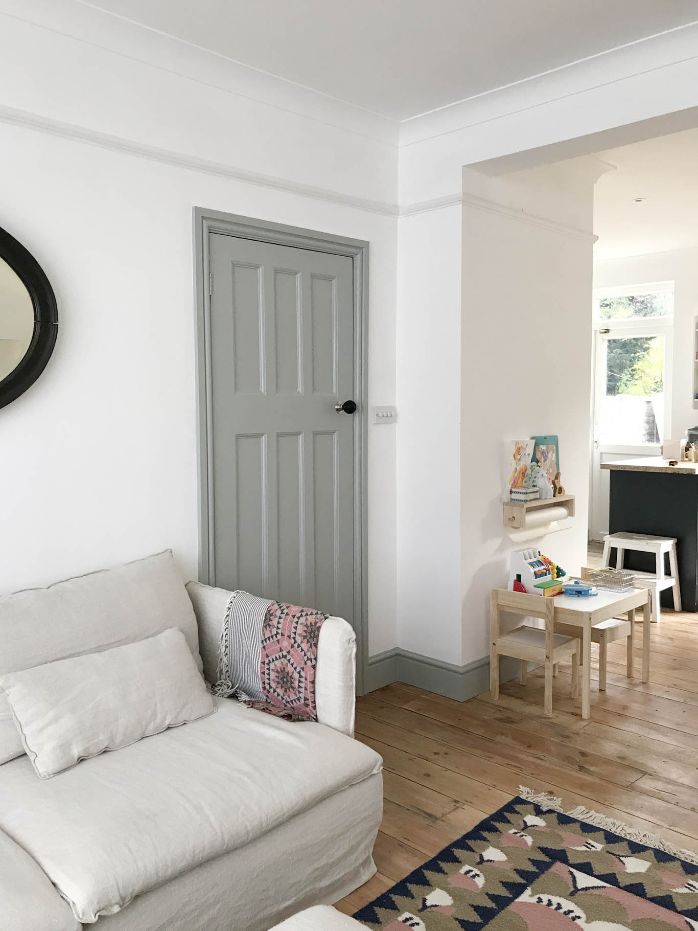
We had all the original 30s doors dipped, which our builder organised for us at a cost of about £20 per door, and then they were either oiled or painted. In the sitting room I decided to have the inside painted Light Blue and the side facing into the hallway I kept natural. The reason for this is that the Light Blue brings a nice dose of colour to the room but in the hallway there is a lot of colour so the natural wood is a nice contrast. The door handles are these ebonised beehive doorknobs, which were the cheapest of this style that I could find. I’m very happy with them so far and I know quite a few of my friends have bought them on my recommendation so fingers crossed they will last.

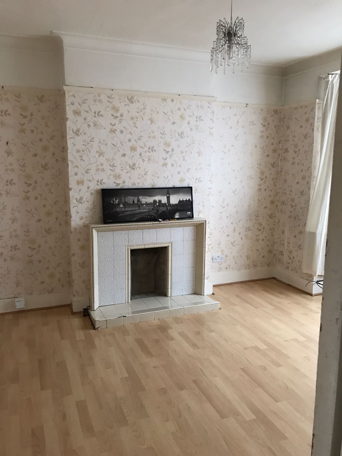
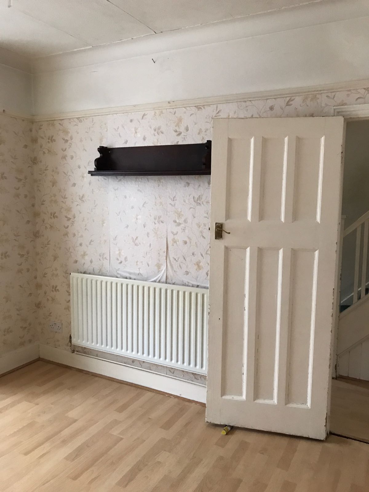
Before

Here are some pics of the works as they progressed to give you an idea of what the renovation involved…

This is looking into the sitting room from the dining room once the wall was removed and before the steel went in.

The room was then completely replastered.

This is looking from the sitting room down to the dining room and the kitchen to the left to give you an idea of the whole space.

The new fire surround was installed as well as coving, picture rail and skirting to bring the period feel back to the room.

Jules started sanding the floorboards at this point. He would recommend paying someone if you can to do it as he HATED the job.

The colour then went onto the woodwork and the doors were re-hung.

After

And here we are today…

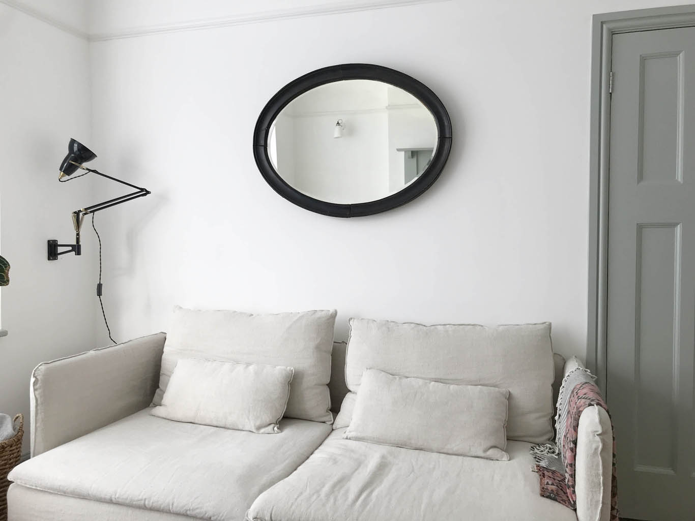
The mirror is a very old one that used to hang in my parents’ wine bar

The Soderhamn chaise fits perfectly in the bay window and Jules and I fight over who is going to lie on it every evening because it is soooo comfortable.

We are still deciding on the tiles for the hearth and we hope to install a woodturner here some time in the future. We also need to figure out storage for Mimi’s toys.

So there you have it. The sitting room as it looks today – nothing fancy and no styling. I look forward to keeping you up to date with changes and additions I make to this room over time. I will also do a more detailed post on the Bemz linen sofa covers that I was kindly gifted so keep an eye out for that.

Katy x

P.S. My next post will be about the hallway and I will publish it in a few days, promise!

Space saving solutions for a small bedroom

Now that the main building work is done and we are due to move in to the house at the weekend I have been working hard on planning the details of how we will furnish each room (I’ve had a vague idea right from the start). Our bedroom is significantly smaller than the old one in the flat so I’ve been thinking about how to make it work for us; both the way it looks and the way it functions. I actually started planning this room before the renovation works began as the small size dictated decisions we had to make from the very beginning i.e. the position of electrics and rehanging the bedroom door.

Here are a few things that we are going to do in order to maximise the space we have in the room as well as a couple of tricks to make the room feel more spacious than it actually is. If any of you have a small bedroom I hope these tips may help you too…

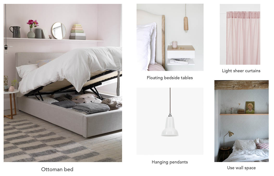
1. Ottoman bed

One of the first things I ordered for the house was a bed. Soon after buying the house I realised our old bed would have to go as the headboard was far too large for our new smaller bedroom and required too much floor space. I sold our old bed before we moved out of our flat and very quickly made the decision to go for an ottoman for the new house with a very slimline headboard to keep as much floor space as possible. The lovely team at Button & Sprung offered to collaborate with me on my bedroom project so they have very kindly made me one of their beautiful ottoman beds that will be arriving this week (very exciting!). I have chosen the Burdock headboard as this sits flush against the wall and is the least imposing style, which I think is important for a small room. I would normally never recommend a divan style bed for a small space as it blocks light and can feel too large and dominate the room BUT the amazing storage space that this ottoman offers is invaluable. I will tell you more about it when it arrives and take pics to show you but I really think it will make all the difference to how well this room will function.

2. Floating bedside tables

Jules and I have always had mismatching bedside tables (and he complains he’s never really had a ‘proper’ one) but in a small room I think symmetry will really help to give an impression of order and space. Also, there is very limited space on either side of the bed (which had to be kingsize – I was definitely not going to compromise on that) so at the moment I am considering these floating bedside tables that take up very little space and with no legs give the feeling of more space than there actually is. I am not 100% decided yet and I think I will wait until the rest of the room is set up before I make my final decision on this (just in case I see something else that I love as I don’t love these I just think they are extremely practical and not unpleasant looking). What do you think?

3. Light sheer curtains

One of the first things that I bought for my last bedroom was a very expensive pair of curtains that were made to measure and beautifully lined but very thick, bulky and heavy. I’m just not sure this will work in our new room as they will steal so much space and block out light at the sides of the windows. When we took the curtains down from our last bedroom when we were moving it was such a shock to see just how much space and light they had blocked (which was fine in such a big, light room but won’t be the case in the new house). Instead I think a cheap black out blind layered with soft, light linen curtain panels may work better. I’m not keen on just having a blind as I think that can feel a bit cold and sterile so linen curtains will help to make it feel warm and cosy but will let the light through during the day and won’t create a huge block at either side of the window when they are drawn. These linen curtain panels look like a good option and not too expensive.

Ottoman bed – Button & Sprung, Flaoting bedside tables – Urbansize, Hanging Pendants – Anglepoise, Curtains – H&M, Wall space image – Old Chatham Farmhouse project designed by Jersey Ice Cream Co.

4. Hanging pendants

I knew from the measurements of the bedroom that we would have to have small bedside tables so I decided early on that we needed either wall lights or hanging pendants. This would free up space on the bedside table and most importantly it would eliminate cables on either side of the bed (which always, always makes a space feel smaller so try to get rid or hide as many as possible!). One of my favourite light designers, Anglepoise, offered me a choice of lights for our bedroom and I immediately decided on the ceramic pendants as I think that a ceramic shade makes for the perfect light as it is diffused so evenly and softly. Our electrics were wired in during week two of the renovation project so I asked for a switch either side of the bed and for electric points for the pendants. I really look forward to seeing the lights up once the bed arrives.

5. Use wall space

The most important thing to do in a small room is to keep as many things off the floor as possible as this gives an impression of a greater amount of space. Use the walls to display and store things – shelves above the bed, hooks to keep clothes off the floor, wall cupboards, a shelf above the doorway. Keep things off the floor and see the space open up.

I’m very excited about putting our room together and showing you how it turns out! If anyone else has a small bedroom and has done anything clever that has maximised space please do let me know.

Katy x

A kitchen on a small budget of £1000

You know when you want to recreate this…

The Arts and Crafts Kitchen by deVOL.

…but you start out with this…

Not very realistic but you’ve got to try, right? Even if you only have about £1000 to spend. Don’t laugh!

So, let me fill you in on what we planned to do with the kitchen as I haven’t spoken about it much, mainly because it was always going to be an after thought as our budget was never going to stretch to a new kitchen and we were well prepared to have a makeshift kitchen until we could afford to extend into the garden and do it properly. Our only stipulation was that the wall between the kitchen and the reception rooms had to go from the start (it wasn’t a supporting wall so needed no steel)! There was no way I could look after Mimi being stuck in a tiny kitchen and not being able to see what was happening next door and it would make cooking dinner in the evenings a one person affair, which I’m not in favour of. Also, and very importantly, I just knew that the dining room would never be used if it were not connected to the kitchen.

This is what we were left with when the wall came down…

The space on the left was the original kitchen and once the wall came down (where the bare brick begins) we were left with a lovely open space.

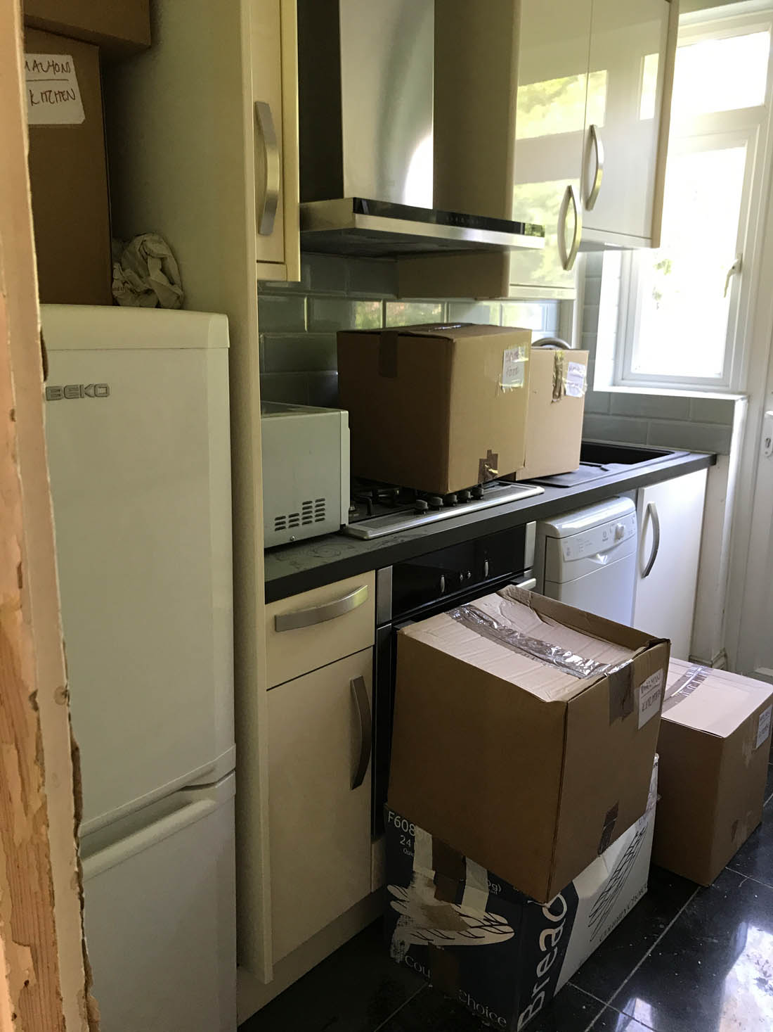
We were still willing at this stage to keep the original cabinets and appliances from the left hand side of the kitchen but everything had to be taken out to fit new plumbing from the bathroom upstairs and so we were left with this…

At this point our builder recommended that we buy some new cabinets as the old ones were on their last legs and we needed a new worktop anyway as originally there was a fridge freezer on the far left of the kitchen and we needed to get rid of that to create more cupboard space below and worktop space above. We agreed that we could afford the bare minimum of cabinets and so our builder measured it all up for us and ordered exactly what we needed from Howdens, which is trade only.He also came up with the great idea of an island that would come out from the wall to house an under counter fridge and freezer and create some actual worktop space. None of this is ideal as there is so little cupboard space and I would never choose an undercounter fridge but I’m absolutely delighted at the idea of an open plan kitchen so I’m not complaining one bit.

To save money Jules is fitting the new cabinets and here are some update pics he has sent me over the last couple of days…

We are keeping the existing oven and hood and leaving those where they were originally positioned to avoid the cost of moving them. We’ve bought three cabinets with shaker door fronts from Howdens to fit on either side of the oven and the new worktop was gifted to us by Mano Mano. It is not what I would choose for my ‘forever kitchen’ as it is laminate but it’s a great solution if you are on a tight budget as it costs just £90 for a 3m worktop and if you have to opt for laminate a white one is the very best option, in my opinion. I’m pleasantly surprised at just how good it looks.

Jules managed to fit this side of the kitchen over the weekend (he’s cutting the hole for the sink, which will go on the right hand side, today). The door fronts we chose are Shaker style (also from Howdens) and I have bought very, very cheap handles from here that cost about 70p each. We ordered the unfinished door fronts that need painting and we’ve decided to go for Railings by Farrow & Ball as I hope that will make it feel a bit more interesting.

Jules started painting the cupboard doors this morning.

On the walls we will have open shelves on the left hand side of the cooker hood and I want to source an antique pine cupboard on the right hand side to tie in with the floor and make the space feel a bit more eclectic than your bog standard fitted kitchen (plus provide much needed storage!!).

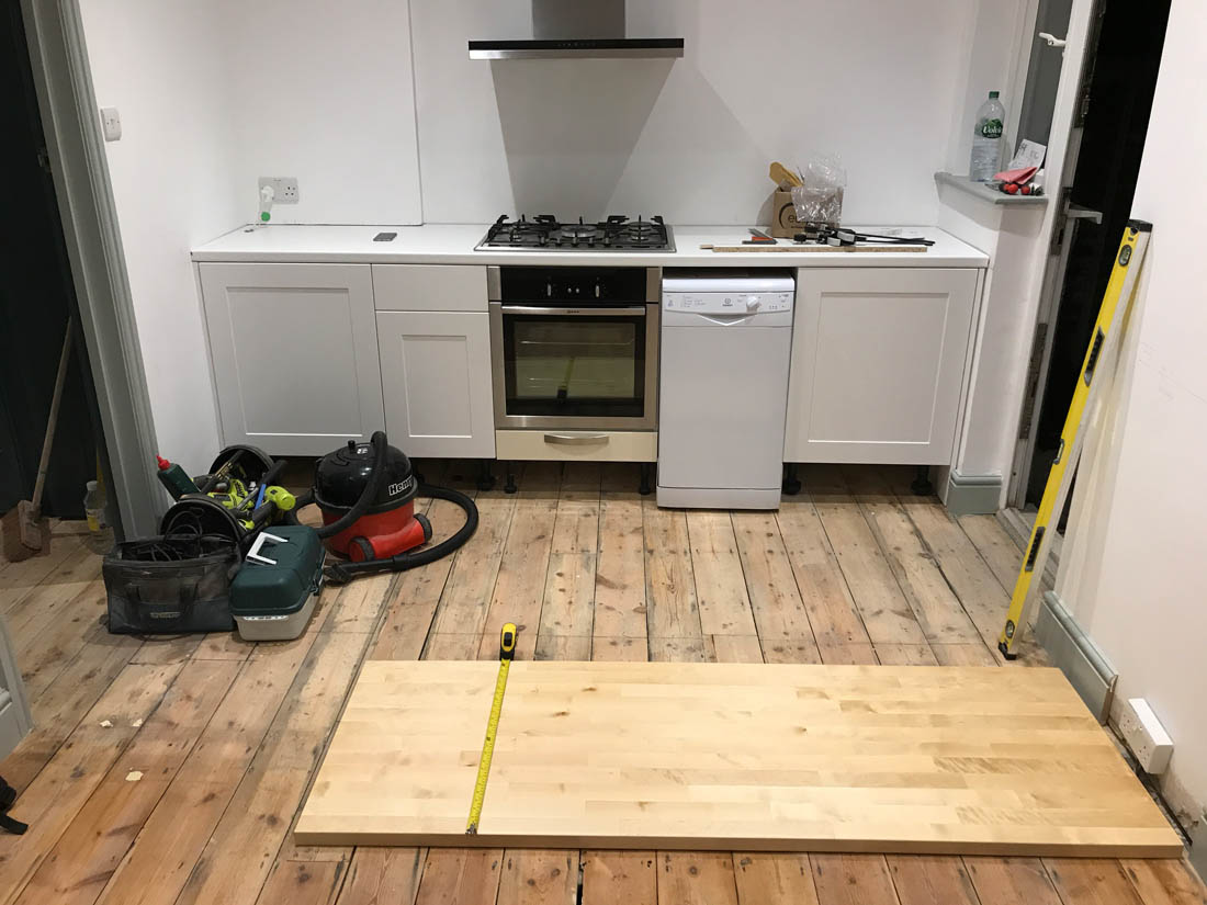
Jules has done a great job fitting this side of the kitchen over the weekend and has started on the island (that you can see laid out on the floor) that will house an undercounter fridge, freezer and integrated bin.

This was the last shot Jules sent me this afternoon (and I hope it will be finished by the time he comes home this evening!). The wooden worktop is birch from Ikea that cost only £100 and he still needs to cut it to length in this pic below…

All in all we have spent £890 on the cabinets and door fronts from Howdens (which is trade only so you have to have your builder order them for you), £100 on the wooden worktop from Ikea, £93 on a new sink from B&Q and £67 on the paint for the cupboard doors from Farrow&Ball (the white laminate worktop was gifted to us by Mano Mano and costs £90). We still have to decide on tiles as well as spending l bit on MDF and brackets to make open shelves and I hope to find a cheap antique wall cupboard but all in all I think we’ve done pretty well to spend so little. I look forward to showing you when it is all finished!

Katy x

The end of our renovation project (almost) and a DIY fail

An almost finished blank canvas

Hello and sorry for the radio silence! We’ve been very busy feeling tired (ha!), running around after a toddler and trying to wrap up the end of our renovation project. Our contractor has been brilliant and basically finished ahead of schedule after eight weeks – unheard of, no? – and then it was Jules’s turn to take over and finish sanding the floorboards that he began some weeks ago. This has dragged on for far longer than anticipated firstly because he only has the weekends (the house is an hour from where we are staying so the evenings after work aren’t really an option) and secondly because I didn’t like the finish and made him re-do it – twice (and still wasn’t happy!). Last week to get things moving and save Jules’s knees we made the decision to pass the last sand and oiling over to our builders. The sanding has now been done, we are having the house cleaned from top to bottom on Wednesday and then the floor will be oiled, the (small) kitchen will be fitted and we have booked to move our furniture in on September 8th – yay! Once we are in there will still be LOADS of small things to do inside like tiling the fireplaces, putting shelves into cupboards, mending the original fire hearths, hanging lights etc but I like the idea of it being an ongoing project and living there for a while to get a feel for what we need and what will work best.

Anyhoo, back to the problems with the floorboards. Basically, I love the colour of the original boards in their raw state but well aware that they will get darker and more orange once they are oiled so I wanted to try out a white stain to try and neutralise the orange. Jules first of all tried out a cheap method our builder suggested, which involved using a mix of white spirit and white emulsion paint. This worked well but looked too much like a white wash, which isn’t what I wanted. Therefore, Jules sanded that off and tried the white stain Osmo oil. We did a sample and the white was barely noticeable so went ahead and used it on a whole room and I hated it! I think the colour of our boards make the white stain look purple almost! It had to go and this was the point at which Jules asked the builders to take over the sanding – ha!! We have now settled on Osmo Raw oil, which is supposed to make the wood look like its raw state and reduce the ‘wet look’ of oil. I’m keeping everything crossed that I like it!

The disastrous results of the white Osmo oil that I hated. This has all been re-sanded and awaiting Osmo Raw oil instead.

A success that I have had in the meantime is choosing a colour for the bathroom, which is now finished. In my last post I had asked for ideas as I was at a loss and although in my mind I was convinced I wanted a dark colour I actually came to the decision to go with a really calm neutral on the woodwork that would give just enough contrast with the white walls and soften the stark white sanitary ware. Here is a peek…it is Ammonite by Farrow & Ball.

A peek of the finished bathroom (before the sink was installed and there will be a mirror below the wall light).

The next couple of weeks are going to be VERY busy with cleaners, the floor being oiled, Jules fitting the kitchen, big new furniture being delivered and then moving in the weekend after next! Wish us luck!

Katy x