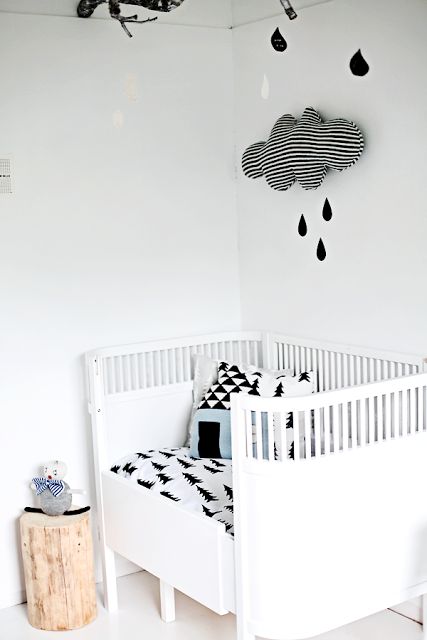
Listen up, Kate…
I’m sorry if I’m about to offend lots of you, but there is nothing I like less than a generic nursery furniture set – BORING! They are usually white, made from horrible laminated wood and a really dull shape. Worst of all, the furniture can only be used for a nursery, so it becomes redundant when the child grows up. I also dislike blue or pink gender-specific rooms.
Here are my tips for making a nursery more exciting, more interesting and a little less generic….
Tip one: Use vintage furniture
Tip two: Don’t use pastel or gender-specific colours
Tip three: Source interesting wallpaper

Available from Famille Summer Belle.

Available from Ferm Living.

Available from Ferm Living.

Available from Mini Moderns.
Tip four: Paint your existing furniture instead of buying a nursery set
Tip five: Add interesting art work

Available from Mimi’s Circus.
Tip six: Use vintage fabrics
What do you think? Do you like these ideas or are you a more traditional pink or blue kind of person? Have you recently decorated a nursery and done something a bit different to the norm? I’d love to see pics – email katy@18.200.196.112 x
P.S. Kate – I’ll be expecting a pic from you, too.


I can’t believe most shops are still so rigid when it comes to gifts and decor for babies – SO boring to have pink or blue not to mention ridiculously old fashioned. I LOVE all these rooms – especially the yellow wallpaper from Ferm. Can I have it? I am a big baby, after all.
Black and white striped cloud with rain drops VG